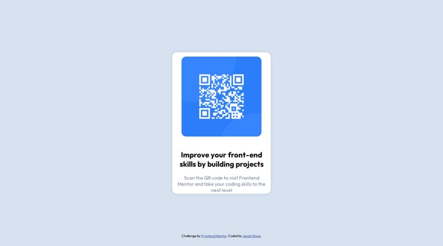
Design comparison
Solution retrospective
I am most proud of being able to complete this. It seemed a little daunting at first, but once I got started I realized that it was not nearly as hard as I thought it would be. One thing I would do differently next time is to get the rough design down first before trying to fine tune and get it perfect.
What challenges did you encounter, and how did you overcome them?The main challenge that I faced while working on this solution was getting the image and the text to stack properly. I overcame this by making the QR "Card" a flex container and setting it to column. Then I put the image and text into their own separate flex child containers, which made them stack vertically the way I wanted them to.
What specific areas of your project would you like help with?My design is not perfect. I had some trouble figuring out the dimensions of both the card and the image and my implementation is not perfectly identical to the provided design. Additionally, I had some trouble having the correct styles applied to a mobile view when I accessed the live site from my cell phone.
Please log in to post a comment
Log in with GitHubCommunity feedback
- @Alex-Archer-I
Hi! I need to say that you have a very interesting approach =)
I can give you a couple suggestions of how make your code a bit easier =)
I see that you already use
flexon the container element. Asflex-directionis column,jstify-contentproperty adjust container's child elements by Y axis. To center them by X axis usealign-items: centerproperty. That'll solve most problems with centering the content. Than you really don't have to applyflexto.qr-imgelement or even wrapimgin thedivtag at all. You can just setwidth: 100%and it'll keep proportions.Also your container element already centered (
bodytag have aflexproperty) so you can get rid ofposition: absoluteand all of those top, left and stuff.As a simple responsive solution you can use this for your container:
.qr-container {
    width: 95%;
    max-width: 400px;
}
In this case container element will keep width of 400px until screen (and the
bodytag) will smaller. That way you can greatly reduce using of media queries.Oh, and
font-optical-sizing: autois default value so you don't have to specify it. But that's cool that you are find it! It's a bit of advanced property =)Well, hope I didn't make it all too complicated and you'll find something useful =)
Good luck and happy coding =)
Marked as helpful - @mfsantosz
i think you just have to practice flex-content
Join our Discord community
Join thousands of Frontend Mentor community members taking the challenges, sharing resources, helping each other, and chatting about all things front-end!
Join our Discord
