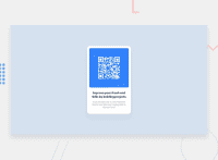
Design comparison
Solution retrospective
I strugled with aligning the text the same way as in the example image. i am still unsure of how to do it properly but i came up with a temporary solution for that.
Community feedback
- Account deleted
Hi @xdcron 👋🏻,
Congratulations for your first submission!
In practice, you need not (and should not) artificially insert
<br>s or split a paragraph into several<div>s just to align text, if that's what your mean. The browser will handle line breaks automatically given a particular container width.For the purpose of replicating the design, setting the right
widthon the.main-containershould do the job.Cheers!
0@xdcronPosted over 1 year ago@peterhohk i appreciate the feedback alot and i will make sure to apply them in my future projects.
1
Please log in to post a comment
Log in with GitHubJoin our Discord community
Join thousands of Frontend Mentor community members taking the challenges, sharing resources, helping each other, and chatting about all things front-end!
Join our Discord

