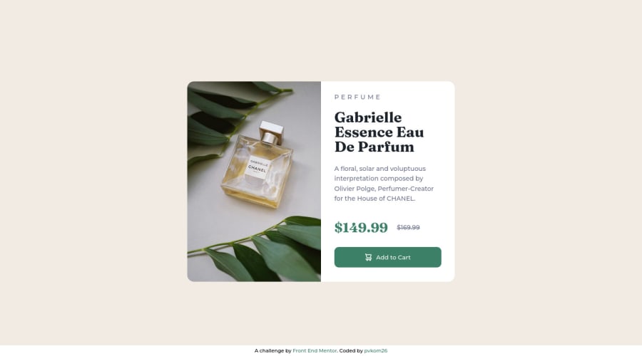
Design comparison
Solution retrospective
Is it OK to turn the <body> element into a flex for a challenge like this? Just to center the card? Or would it be better to wrap the card into a <div> for that?
Also, if the card is the <main> element and it gets wrapped into a <div>, would it be more semantically correct to make the wrapper <main> and turn the card into a regular <div>? I doubt it but want to see what the community thinks.
Love this website, helps me a lot!
Community feedback
- @GiDDeRoPosted about 2 years ago
This is a nice solution.
-
Actually yeah, you could do that. Look at it this way, you are gonna be saying (coding), the body to center its element. And the only and main element is the card. Even tho, what you gonna do about the footer, if the card is all wrapped in a div. Personally, I think you done a great job
-
Depending on your approach. Personal preference: But since the card is literally the "main" element, another <div> container wouldn't be needed. Yunno, it gives the code simplicity and clarity.
Happy coding
Marked as helpful1 -
Please log in to post a comment
Log in with GitHubJoin our Discord community
Join thousands of Frontend Mentor community members taking the challenges, sharing resources, helping each other, and chatting about all things front-end!
Join our Discord
