Design comparison
Solution retrospective
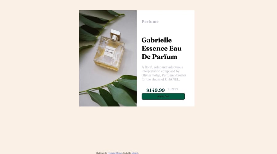
I found it difficult to add the image on the add to cart button and also having the rounded borders. I used the rounded border pixels but the images just did not have rounded borders. I am having fun practicing with front end mentor, any feedback is highly welcome and encouraged i want to get better.
Community feedback
- @SasaVaticPosted over 1 year ago
Hi KingMisach, great work you have done here 🙌🏻 and I am happy to improve my own skills by looking into your codebase.
Here are some suggestion for this and future projects:
- it is common practice to reset default styles on html elements, people often write this piece of code as the first line of CSS code or below any @import you may have in CSS file. This is useful so you don't have to reset default margins and paddings in every ruleset where you need different spacing then one which is set up on element by default. And border-box is much more responsiveness friendly. Research what is box-sizing and how does it impact layout of the elements on the page and why it comes handy to set it to border-box. It will help you very much in the future. I encourage you to use it but first research!
*, *::before, *::after { margin: 0; padding: 0; box-sizing: border-box; }- rather then using relative and absolute position to position your wrapper <div> elements on the screen it would be better practice to leave them to their default values and work with display property with values set to flex, block, inline-block... Don't think it is bad to use relative and absolute units they are very very useful CSS properties but you should ask your self when it is right time to use them. If not used in right way they can mess up responsiveness and your layout.
- rounded border can be set by adding border radius to parent element and if any edge of child element is overflowing parent element you can set overflow: hidden to parent or set same border radius to child element on edges which are overflowing parent element.
- you can add image to your button by simply putting img element inside your button element or using library for icons like fontawesome via link inside your head tag. But I believe icon is provided with design files and I'm not certain in which format.
- I will highly encourage you to try Kevin Powell's Conquering Responsive Layouts Course. It will help you so much in structuring and writing your HTML and CSS code. You will learn how to correctly convert design to Responsive Layout using HTML and CSS.
- and last, I played around with your code and add couple of tweaks to it. It's not perfect but you can play with it by commenting or deleting properties in CSS to see what happens. JSFIddle Product preview card component
Keep learning and improving you skills. Best wishes on your programming path 😊🙏
Marked as helpful0@KingMisachPosted over 1 year ago@SasaVatic thank you so much for your feedback. Your insights are really helpful. I will definitely go on and research on border-box and your code has really given me better insights on areas that I was having difficulties with.
1
Please log in to post a comment
Log in with GitHubJoin our Discord community
Join thousands of Frontend Mentor community members taking the challenges, sharing resources, helping each other, and chatting about all things front-end!
Join our Discord
