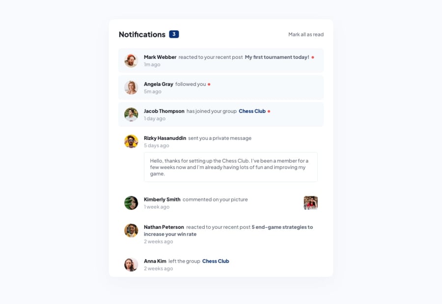
Design comparison
SolutionDesign
Solution retrospective
What are you most proud of, and what would you do differently next time?
Next time I'll analyse better the images because the bold sentences are links. A reminder for my future projects. In this case it didn't matter, so I chose to leave it like that.
What challenges did you encounter, and how did you overcome them?Nothing special. Only I thought for creating the circles you needed to custom dots, but it was just a span with a border-radius: 50%
What specific areas of your project would you like help with?It's a good practice to nest CSS like that? Check the .message in the style.css
Community feedback
- @WismalPosted 9 months ago
I don't know why but some style doesn't appear in the design comparison
0
Please log in to post a comment
Log in with GitHubJoin our Discord community
Join thousands of Frontend Mentor community members taking the challenges, sharing resources, helping each other, and chatting about all things front-end!
Join our Discord
