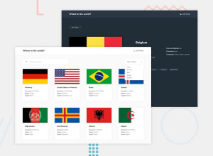
pure javascript, pure CSS.
Design comparison
Solution retrospective
this project was easier for me than some of the intermediate ones xD
Community feedback
- @pikapikamartPosted almost 3 years ago
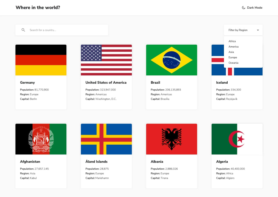
Hey, great work on this one. On desktop layout, I think making each country card a bit smaller will be better because right now on my end, I only get 2 country card on a single row. I am using a 1366x768 monitor. The site is responsive though and the mobile state looks great.
Some other suggestions would be:
- Currently the theme toggle only works for mouse clicks because you aren't using any interactive elements on it. Remember when creating interactive component, interactive element should be used. On this one or in general when you are creating a theme toggle, you should use radio buttons that are inside a
fieldset
with alegend
.Have a look at this simple snippet that I have implementing this one or you can see my solution on this same challenge. Let me know if you have any queries on this one. - You don't need to use
nav
to wrapped the search and filter bar on themain
tag. You should useform
for the search bar since data is being manipulated on that one and to make the markup clear. - Your
input
right now currently lacks associatedlabel
to it or anaria-label
to which will define the purpose of theinput
element. Always include it so that user will know what they need to give on eachinput
. Make sure thatlabel
is pointing to theid
of theinput
as well. - For the filter bar, again it is not accessible since you are not using interactive elements. For this one, you can use a
select
tag, though it can't be styled I think? But it will be better than the current implemented one. Another approach would be to use arole="listbox"
on this one. You can see that implementation on my solution as well. - Also, your filter dropdown is not being hidden properly. Right now, it is only hidden visually by using
transform
but it is still being picked up by assistive tech. Add an extravisibility: hidden
on the hidden state and usevisibility: visible
when the dropdown is being shown. - For each card, the
:hover
state for me is too much. It scales the element too big, a subtle one would be much better than overdoing it. - Since you are making the country card a link, use
a
tag for this one and not justdiv
. Remember, when a component navigates a user on another page,a
tag should be used. For this one, you should only use thea
tag to wrap theimg
and make sure that thea
tag is not containing the full country card because that will be an invalid markup. Another approach would be to use like a::after
of thea
tag to occupy full height and width of the country card so that it will be clickable. - For those 3 information about the country, as you can see they are "list" of information so it would be nice to use
ul
on those one.
VISITING A COUNTRY(on your app):
- The
go back
should be also a link and not abutton
since it directs a user in a another page.button
are for control anda
tag are for links. - Also, I instantly get a mobile state view for the page, your breakpoint on that one is too big I think, toning it down would be really nice.
- Your country image is missing the
alt
attribute. When usingimg
tag, do not forget to add thealt
attribute, whether the value is empty or not. Because by not including it, screen-reader will instead read the source path of the image which you don't want. So always include it. - You can use
h1
for the country name on this one since it is all about the specific country when visiting one so it makes sense to useh1
. - Again, those 8 items are "list" of information about the country so using
ul
would be nice. - When wrapping up a text-content, make sure that it is inside a meaningful element like
p
tag or heading tag and not using likediv, span
to wrap the text. - For the name
border countries
you can use a heading tag on that since it gives information about what the section will contain. - Those border-countries as well should be using
a
tag since they are links to view a another country. There are lots of usage of not accessible elements on this one which are treated as interactive.
But still, great job again on this one.
Marked as helpful1@Sergio-Ivan-MelgarejoPosted almost 3 years ago@pikapikamart
Now that you tell me that, yes, I have to change a lot.
But, I am confused about the "a" tag, it is a single page, where do I redirect it?
and ... sorry, my english is not good. And thank you for taking the time to teach me.
1@pikapikamartPosted almost 3 years ago@Sergio-Ivan-Melgarejo Hey, great that you find my review useful:>
Typically on a spa like this one, since you are changing the full content of the site when choosing a country page, it would be nice to change the page link as well to something like
https://sergio-ivan-melgarejo.github.io/Front-Mentor-23/philippines
Because using a
button
, a user would expect that it will control something like opening up a modal, a form and other interactivity. But since you are simulating a page navigation on this one, usinga
tag in react, theLink
component would be nice to use and the react-router.0 - Currently the theme toggle only works for mouse clicks because you aren't using any interactive elements on it. Remember when creating interactive component, interactive element should be used. On this one or in general when you are creating a theme toggle, you should use radio buttons that are inside a
Please log in to post a comment
Log in with GitHubJoin our Discord community
Join thousands of Frontend Mentor community members taking the challenges, sharing resources, helping each other, and chatting about all things front-end!
Join our Discord