Design comparison
SolutionDesign
Solution retrospective
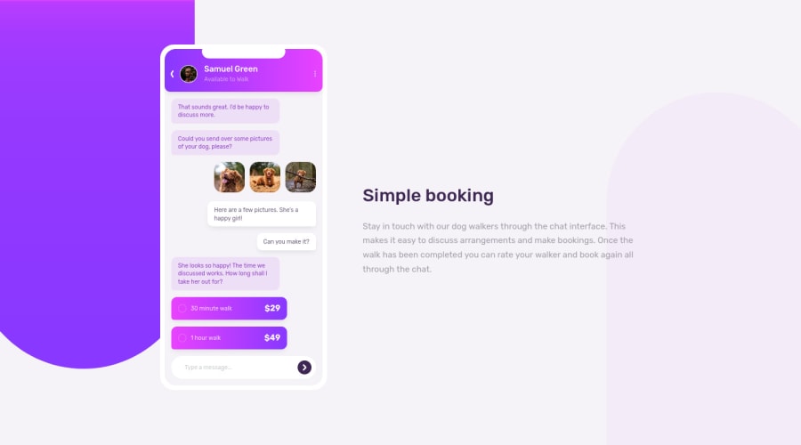
My biggest struggle was getting the two colored background illustrations in both corners to be fully responsive. Feedback is welcome on better ways to do it :)
Community feedback
Please log in to post a comment
Log in with GitHubJoin our Discord community
Join thousands of Frontend Mentor community members taking the challenges, sharing resources, helping each other, and chatting about all things front-end!
Join our Discord
