Design comparison
Solution retrospective
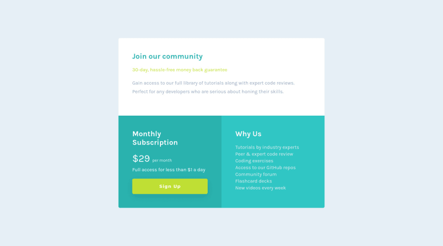
Tried using CSS Grid but kept seeing some extra bottom padding in the "Join our community" section on desktop. Setting a fixed height did not fix the issue, so I transitioned to use Flexbox instead.
I wasn't able to get a box shadow working for the main card (although I was able to get it for the button), not really sure why so any tips on that would be helpful!
Community feedback
- @AditNovadiantoPosted about 3 years ago
Hi ! Good Job Skye
These below mentioned tricks will help you remove any Accessibility Issues
-> Add Main tag after body like it should be your container. For 1st heading or h1 tag, use header tag and then inside the header put your h1 or h2 etc . But use header tag only once in main heading element.
enjoy the coding!!!
0 - @GoranK89Posted about 3 years ago
Hello Skye! Regarding the box-shadow, you can wrap ".community" and ".bottom-wrapper" together into a new div and apply a shadow to that, or you can just apply it to the main html element. Other than that minor detail it looks great!
0
Please log in to post a comment
Log in with GitHubJoin our Discord community
Join thousands of Frontend Mentor community members taking the challenges, sharing resources, helping each other, and chatting about all things front-end!
Join our Discord
