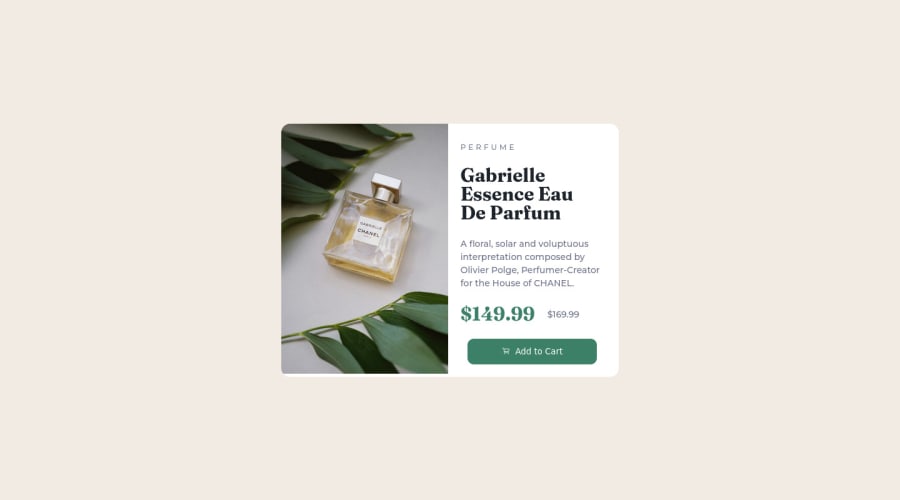
Design comparison
SolutionDesign
Community feedback
- @rostyslav-nazarenkoPosted almost 2 years ago
Hi, Alexsander!
- HTML
- wrap your code in
maintags or changediv class="container"tomain="container - I personally wouldn't exclude P E R F U M E text from HTML as it provides additional information to people who use screen readers, but that is definitely a cool example of using
::beforepseudo-selector 👍 - use
h1instead ofh2 - I don't know a lot about accessibility but use
delorsfor the old price, plus some read-only text to provide more information - use the `picture`` element for providing two images that will change if the viewport gets to a certain width. Read this article it has great examples for different use cases
- wrap your code in
- CSS
- it is not recommended to set
font-size: 62.5%;read about it here - use
min-height: 100vhon the body element to allow scrolling, if you try to resize the window you will see that - I wouldn't separate CSS in two different files only if you use media queries in the
headelement so there wouldn't be additional calls to the server
- it is not recommended to set
Keep it up! Can wait for your next solutions!
Marked as helpful1 - HTML
Please log in to post a comment
Log in with GitHubJoin our Discord community
Join thousands of Frontend Mentor community members taking the challenges, sharing resources, helping each other, and chatting about all things front-end!
Join our Discord
