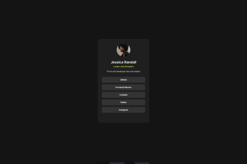
Submitted about 1 year agoA solution to the Social links profile challenge
Pure HTML CSS Social Media link Page

@Mohammed-morsiwala
Solution retrospective
What are you most proud of, and what would you do differently next time?
Structured CSS with hands on flex box & more confident on HTML structure
What challenges did you encounter, and how did you overcome them?Still facing issues in deciding width Hight & make the design responsive
What specific areas of your project would you like help with?I want to understand min-with max-with with media query to make website responsive
Code
Loading...
Please log in to post a comment
Log in with GitHubCommunity feedback
No feedback yet. Be the first to give feedback on Mohammed's solution.
Join our Discord community
Join thousands of Frontend Mentor community members taking the challenges, sharing resources, helping each other, and chatting about all things front-end!
Join our Discord