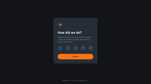
Submitted about 1 year agoA solution to the Interactive rating component challenge
Pure HTML + CSS + JS solution using CSS flexbox layout
@h13meyer

Solution retrospective
What are you most proud of, and what would you do differently next time?
I tried to take the feedback of my first submitted solution into account: I hosted the required font directly inside the project and also used a set of CSS reset rules to faciliate development.
What specific areas of your project would you like help with?Since I worked on this challenge as part of the "Web Accessibility" learning path, I would appreciate improvement suggestions regarding that topic.
Code
Loading...
Please log in to post a comment
Log in with GitHubCommunity feedback
No feedback yet. Be the first to give feedback on h13meyer's solution.
Join our Discord community
Join thousands of Frontend Mentor community members taking the challenges, sharing resources, helping each other, and chatting about all things front-end!
Join our Discord