

Design comparison

Community feedback
- @Mayen007Posted 4 months ago
Great work on this! You're really on the right track, but there's always room to polish the design a little more. Let's dive in!
1. Responsiveness
You're doing a solid job with responsiveness, but I noticed that setting
width: 100vwon the body/html can cause horizontal scrolling on small screens (like 375px and below). This happens because the browser sometimes includes the width of the scrollbar in the viewport calculation.To fix this, try one of these:
-
Option 1: Add this to prevent padding/margins from expanding the width:
* {
  box-sizing: border-box;
}
This makes sure padding and borders don’t affect the total width of elements.
-
Option 2: You can switch to using
width: 100%on bothhtmlandbody, which avoids the scrollbar issue on smaller screens.
These small tweaks will clean up the horizontal scrolling problem and keep the design nice and responsive!
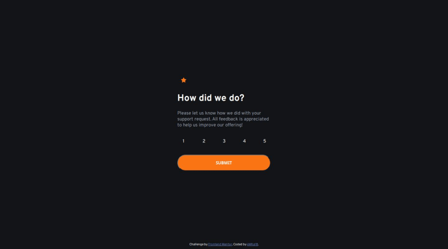
2. Submit Button
You're doing great with your button, but I noticed a noticeable white border that isn't in the design. This can be easily fixed by removing the border:
button {
  border: none;
}
That'll bring it more in line with the intended design!
Keep up the awesome work—you're doing fantastic! These tweaks will only make it even more polished.
Happy Coding!
Marked as helpful0 -

Please log in to post a comment
Log in with GitHubJoin our Discord community
Join thousands of Frontend Mentor community members taking the challenges, sharing resources, helping each other, and chatting about all things front-end!
Join our Discord