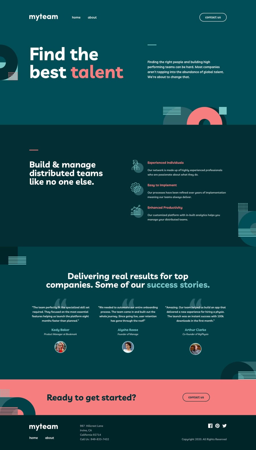
Design comparison
Solution retrospective
Hi, I'd really like to know your opinion about this solution. What concerns me the most is:
- do I use BEM correctly?
- is the website accessible?
- is the file structure within the SCSS folder readable?
Thank you in advance for your feedback!
Community feedback
- @mattstuddertPosted over 4 years ago
Hey Jakub, it's great to see you posting a solution for this challenge. I hope you enjoyed it! As @hoehooiyan mentioned, your BEM naming is fine and you would definitely benefit from looking into folder architecture for your styles. The 7:1 pattern is great. Others to look into and take inspiration from are SMACSS and ITCSS. If you research those 3 you'll be in a great position to start structuring your projects in a way that will scale well with larger projects.
As for the accessibility of the project, here are a few things that I've picked up:
- You've got accessibility errors in your report, which could be resolved. Bethany has provided a great resource for you to learn more.
- For the
alttext on the open and close icons for the mobile menu, you're currently being very literal with "menu open icon" and "menu close icon". Try to be more descriptive of the action in these situations. For example, "Open menu" and "Close menu". - Your buttons for the team page are currently missing
alttext, which will make them inaccessible to screen reader users as it won't describe the action. - You're also missing labels or
aria-labelattributes on the contact page form. These are needed for screen reader users to know what the input is for. The accessibility report hasn't picked these up as it currently only tests the homepage, which is something we'll be changing soon.
One other small point: the "Contact Us" links in the "Ready to get started?" section on the homepage and about page currently don't link to the contact page.
Keep up the great work!
2 - @hoehooiyanPosted over 4 years ago
Hey there, your solution looks nice! Only a little adjustment to be made and it would be the same as the design.
-
I just reviewed your code. The BEM usage is correct 👍
-
For the accessibility report, I can see that there are 3 errors which are about the anchor tag problem, maybe it's because the provided link is not correct. You may need to write it like so
href="https://www.facebook.com" -
The SCSS folder structure would be better if you group those same elements inside the same folder. Or you may follow the 7-1 architecture
- base
- abstracts
- components
- themes
- pages
- vendors
- layouts
The 7-1 architecture would be useful when we are doing a larger project.
2 -
- @whimsicurl-creationsPosted over 4 years ago
Nice job tackling this multi-page design. It looks like you've done a wonderful job with the layout and adding all the details (hover states, collapsed navigation for mobile, etc.).
I haven't worked with BEM or SCSS yet, so I can't speak to those areas of your code. As for the accessibility, I wonder if you can add the aria-label to the anchor tag to resolve the issue. Here's a link on CSS-Tricks about Accessible SVGs: https://css-tricks.com/accessible-svgs/. Scroll to Example 3: Linked Icon, no text (not quite halfway down the page) since that is what you have for your social links in your footer.
Again, wonderful job on your solution. Thanks for submitting it and allowing us to learn from your solution as well!
1
Please log in to post a comment
Log in with GitHubJoin our Discord community
Join thousands of Frontend Mentor community members taking the challenges, sharing resources, helping each other, and chatting about all things front-end!
Join our Discord
