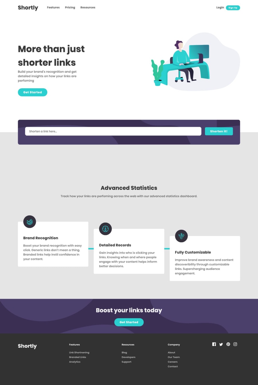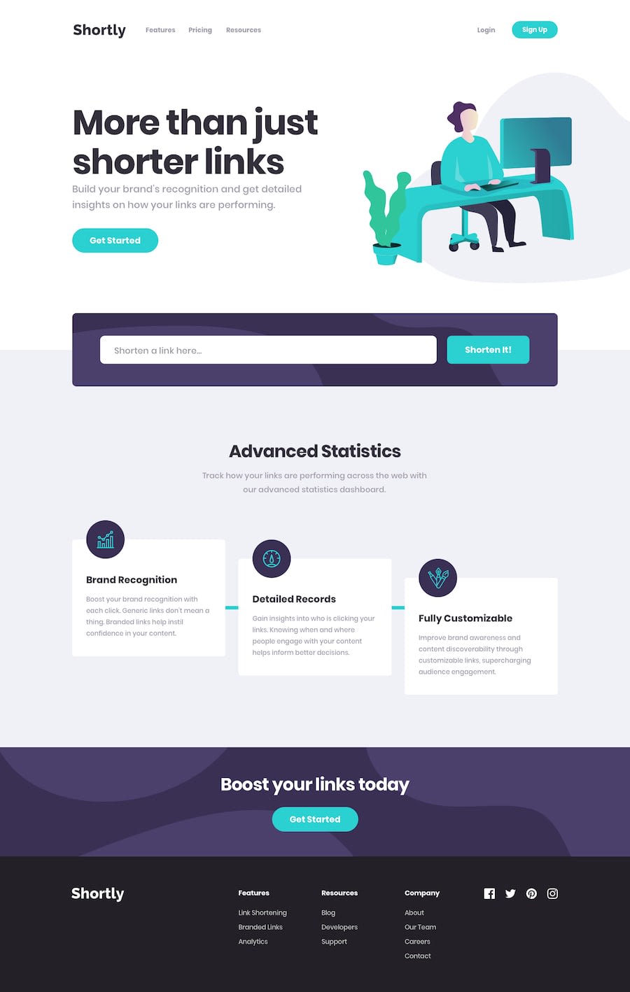
Design comparison
SolutionDesign
Solution retrospective
Any feedback will be appreciated!
Community feedback
- @mattstuddertPosted almost 5 years ago
Hey Shahmir, great work on this! Your solution looks great. The only suggestions I've got are very small:
- I would always recommend only ever having a single
h1on the page. The "More than just shorter links" heading is perfect for that on this design. - If this were a fully-functioning website, you'd expect the "Get Started" call-to-action to link to the sign-up page, so I'd say an anchor tag is more appropriate than a
button. - The social links in the
footerwould also be clickable links, so anchor tags would be good here too.
These are all very small/quick fixes though. You've done a really good job. Keep up the great work! 👍
0@shahmirfaisalPosted almost 5 years ago@mattstuddert Thanks for your suggestions😘😘😍😍
0 - I would always recommend only ever having a single
Please log in to post a comment
Log in with GitHubJoin our Discord community
Join thousands of Frontend Mentor community members taking the challenges, sharing resources, helping each other, and chatting about all things front-end!
Join our Discord
