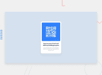
Design comparison
Solution retrospective
Proud of the structure I created.
What challenges did you encounter, and how did you overcome them?Vertically positioning in the centre was hard for me. Overcame it by asking chatgpt
What specific areas of your project would you like help with?Centering elements
Community feedback
- @shwertsPosted 4 days ago
Greetings, I see that you solved this challenge very good! Here's some moments for future considerations you should take to improve your frontend skills:
-
Use
classinstead ofid, second can be used only to be used in JavaScript and for anchoring. Using classes can shorten selectors in every ruleset. -
For
font-sizeand element's sizing properties you should useremmostly oremunits to tolerate user's personal font settings. Relative units bases on user's font size settings, for most users, they have16pxfor font size, so you can base on it.
1 -
- @m-abubakr1Posted 4 days ago
I see you have found the right font for it, I missed that one.
0
Please log in to post a comment
Log in with GitHubJoin our Discord community
Join thousands of Frontend Mentor community members taking the challenges, sharing resources, helping each other, and chatting about all things front-end!
Join our Discord

