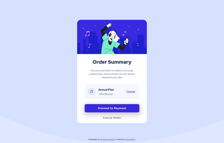
Design comparison
SolutionDesign
Solution retrospective
Hi!
Do you know any good tutorials on mobile-first design? I have never done that and I would like to try.
Because, as you can see, my code isn't very "responsive" and I used some pretty dumb ways to make it look a little bit better.
Community feedback
Please log in to post a comment
Log in with GitHubJoin our Discord community
Join thousands of Frontend Mentor community members taking the challenges, sharing resources, helping each other, and chatting about all things front-end!
Join our Discord
