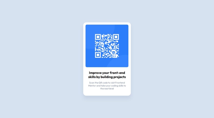
Design comparison
Solution retrospective
I would like to try some css framework next time
What challenges did you encounter, and how did you overcome them?not much challenge in this one
What specific areas of your project would you like help with?best practice of the code
Community feedback
- P@nicholas-crawfordPosted 12 months ago
Good use of vars and I like your use of flex.
One thing to consider is that on a smaller, older phone, this might be a little big. It's something that might come up if your user base doesn't upgrade to the latest phones.
Targeting elements instead of making CSS classes works in this case, but it would make things difficult in a larger application.
Also, I think you need to increase the font weight or size a bit more to match the screenshot. (Not entirely sure which)
Good attempt!
0
Please log in to post a comment
Log in with GitHubJoin our Discord community
Join thousands of Frontend Mentor community members taking the challenges, sharing resources, helping each other, and chatting about all things front-end!
Join our Discord
