Submitted over 1 year ago
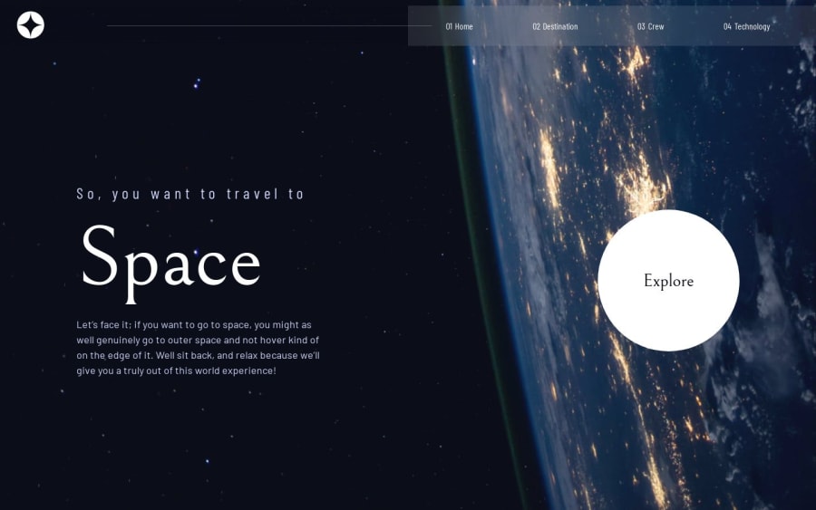
pure css,html,js with some Errors I can't solved
@Abdokhalil11
Design comparison
SolutionDesign
Community feedback
- @0xabdulkhaliqPosted over 1 year ago
Hello there 👋. Congratulations on successfully completing the challenge! 🎉
- I have other recommendations regarding your code that I believe will be of great interest to you.
HTML 🏷️:
- This solution may cause accessibility errors due to lack of semantic markup, which causes lacking of landmark for a webpage and allows accessibility issues to screen readers, due to accessibility errors our website may not reach its intended audience, face legal consequences, and have poor search engine rankings, highlighting the importance of ensuring accessibility and avoiding errors.
- What is meant by landmark ?, They used to define major sections of your page instead of relying on generic elements like
<div>or<span>. They are use to provide a more precise detail of the structure of our webpage to the browser or screen readers
- For example:
- The
<main>element should include all content directly related to the page's main idea, so there should only be one per page - The
<footer>typically contains information about the author of the section, copyright data or links to related documents.
- The
- So resolve the issue by replacing the
<div class="landing">element with the proper semantic element<main>in yourindex.htmlfile to improve accessibility and organization of your page
.
I hope you find this helpful 😄 Above all, the solution you submitted is great !
Happy coding!
Marked as helpful0 - @lack21Posted over 1 year ago
Good work 👍, but there are some problems!
- The background image on body is not taking the full space, it's repeating, so I suggest you to add 'background-size: cover' to the body so background image gonna take the full space.
- Your links works only then, when text is clicked not numbers (01, 02, etc.) so remove '::before' where this numbers are located and just add them in 'a' anchor like this (<a class="home">01 Home</a>).
- This is not a problem, but just a recommendation, add 'cursor: pointer' in every button there is, it's gonna be easier to understand what's clickable and what's not for the user.
Marked as helpful0
Please log in to post a comment
Log in with GitHubJoin our Discord community
Join thousands of Frontend Mentor community members taking the challenges, sharing resources, helping each other, and chatting about all things front-end!
Join our Discord
