Design comparison
SolutionDesign
Solution retrospective
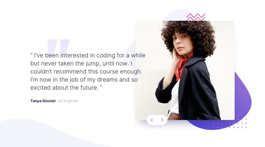
I used a bit more absolute position than I would've liked. Could I improve that somehow? Positioning all these elements was a bit frustrating without it. Thanks!
Community feedback
- @DarknessflowersPosted over 4 years ago
Looking really good! Only thing I would consider is adding some CSS transitions to ease how jarring switching can feel. I think the instances you've used absolute positioning make sense.
0
Please log in to post a comment
Log in with GitHubJoin our Discord community
Join thousands of Frontend Mentor community members taking the challenges, sharing resources, helping each other, and chatting about all things front-end!
Join our Discord
