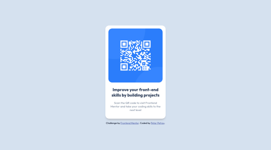
Design comparison
Community feedback
- @correlucasPosted over 2 years ago
👾Hi @petarchou, congratulations on your solution!👋 Welcome to the Frontend Mentor Coding Community!
Great solution and a great start! From what I saw you’re on the right track. I’ve few suggestions for you that you can consider adding to your code:
- Use
<main>instead of a simple<div>this way you improve the semantics and accessibility showing which is the main block of content on this page. Remember that every page should have a<main>block and that<div>doesn't have any semantic meaning. - Add the
alt textto improve accessibility.The alt attribute provides alternative information for an image if a user for some reason cannot view it (because of a slow connection, an error in the src attribute, or if the user uses a screen reader). ---><img src="./images/image-qr-code.png" alt="QR Code Frontend Mentor"> - Replace the
<h2>containing the main title with<h1>note that this title is the main heading for this page and every page needs one h1 to show which is the most important heading. Use the sequence h1 h2 h3 h4 h5 to show the hierarchy of your titles in the level of importance, never jump a level. - Use relative units as
remoreminstead ofpxto improve your performance by resizing fonts between different screens and devices. These units are better to make your website more accessible. REM does not just apply to font size, but to all sizes as well.
Here's my solution for this challenge if you wants to see how I build it: https://www.frontendmentor.io/solutions/qr-code-component-vanilla-cs-js-darklight-mode-nS2aOYYsJR
✌️ I hope this helps you and happy coding!
Marked as helpful0@petarchouPosted over 2 years ago@correlucas I love interactive websites and was just about to start learning DOM Manipulation, thanks for sharing.
0@petarchouPosted over 2 years ago@correlucas I'm going through your solution of the challenge and see you are using flexbox. I assume its a modern concept thats used everywhere nowadays but i didnt see it in the css tutorials I watched. So to be sure, I want to ask - should I learn it and use it as a main styling tool?
0 - Use
- @kostyafarberPosted over 2 years ago
Hey there!
Awesome solution. It looks great!
Just a couple of points of feedback if you don't mind!
- You should wrap your content in a
maintag as this represents the 'content' of your page see here - You don't have to set the
@font-faceeverywhere! You can just go on google fonts and use the@import url()in your css. - I would analyse the pixel size using your computer on the image file and set your container to that size to achieve pixel perfect proportions as close to the image as possible (e.g
ctrl+alt+4on a mac) - Consider using a CSS reset to remove some annoying default settings (e.g)
Really good solution!
Happy coding!
if you found my feedback helpful please mark it as helpful :)
Marked as helpful0@petarchouPosted over 2 years ago@kostyafarber Hey, Kostya, can you elaborate a bit more on point 3? -
Do you mean to analyse the desktop-preview image? And another thing, I read that css pixels and device pixels dont always match. Does that affect measurement in any way or do we take care of it with the viewport tag or some css property?
0 - You should wrap your content in a
Please log in to post a comment
Log in with GitHubJoin our Discord community
Join thousands of Frontend Mentor community members taking the challenges, sharing resources, helping each other, and chatting about all things front-end!
Join our Discord
