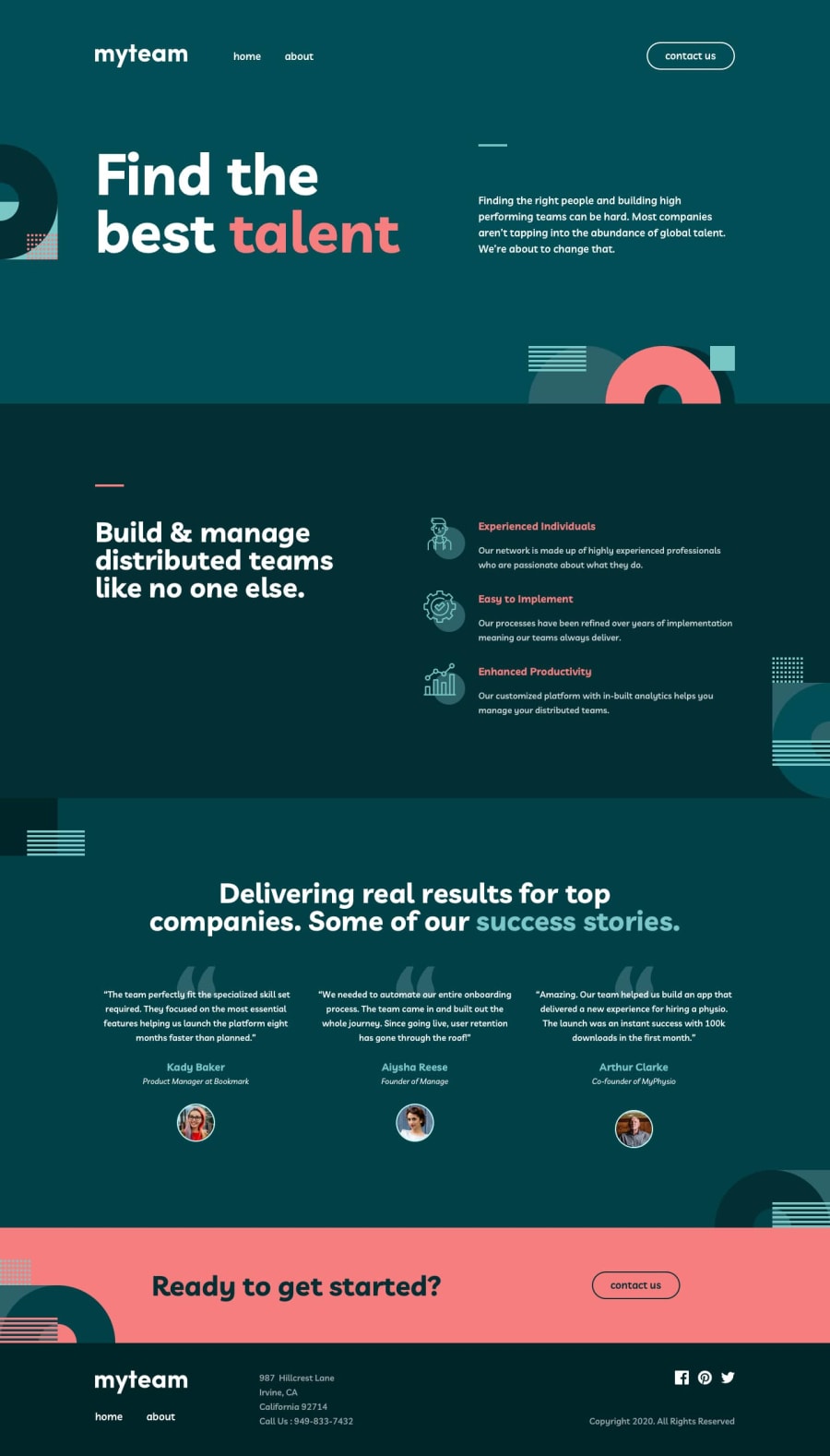
Design comparison
SolutionDesign
Solution retrospective
I'm open to any and all feedback.
Community feedback
- @mattstuddertPosted over 4 years ago
Awesome work on this challenge, Shashi! Your solution looks really good. If I'm using Sass and BEM I typically use the tailed modifier approach as well. So it's good to see someone else using it!
I really like the animation details you've added as well 😍
Here are a few small points after taking a look at your project, but these a pretty minor things:
- At around
500pxyourh1on the homepage has a single word per line. So this could be reviewed to make it more readable at this kind of device size. - I'd add a
ulinside theaddresselement for the location of the office as opposed tobrtags. But perhaps this is just my personal preference. - One way of enhancing the contact form would be to add custom styled form validation as opposed to relying on the default HTML5 validation styles which aren't the nicest.
You've done a really good job on this. I hope you enjoyed the challenge! 🙂
2 - At around
Please log in to post a comment
Log in with GitHubJoin our Discord community
Join thousands of Frontend Mentor community members taking the challenges, sharing resources, helping each other, and chatting about all things front-end!
Join our Discord
