Design comparison
Community feedback
- @devQuanPosted about 3 years ago
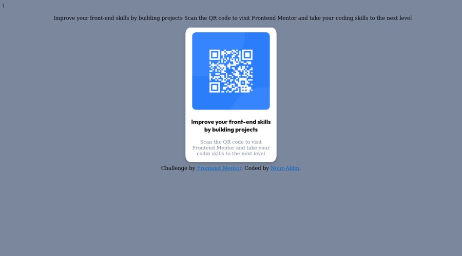
Great job on your solution! The only thing I would have done differently is written my HTML more semantically. I would replace the div tags with section tags. Also, instead of dominating your layout with the box model, I would use either flexbox or grid. These are only suggestions, seeing as you still got the job done.
Marked as helpful1 - @bobbe86Posted about 3 years ago
Nice job. Just so you know, they have the colors and fonts used in the style-guide file. I would also try display:flex on your css with justify (content or items?):center and align (items or content):center to get it right in the middle. I never know which one will work so I always try with both. Justify controls the left and right movement while align controls the up and down.
Marked as helpful1
Please log in to post a comment
Log in with GitHubJoin our Discord community
Join thousands of Frontend Mentor community members taking the challenges, sharing resources, helping each other, and chatting about all things front-end!
Join our Discord
