

Design comparison
SolutionDesign

Community feedback
- @Sdann26Posted almost 3 years ago
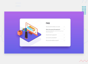
It is well done although the image is cut off when making the responsive. What I did to solve this problem in your design is to add the following attributes to the following classes (Please note that these rules are for mobile screen size).
To
.img-containertop: -13em; position: absolute; height: 75%; left: 4em;A
.holderposition: relative;A
.faq-containerposition: relative; top: 6em;Obviously you can do better but play with the measures and you will get the expected final result. I hope I helped you. Good luck.
Marked as helpful0@thefolakePosted almost 3 years ago@Sdann26 Thank you so much! I had issues with that image thing on mobile. This helped a lot. Thank you so much I have made adjustments now. Can you take a look now please?
0

Please log in to post a comment
Log in with GitHub
Join our Discord community
Join thousands of Frontend Mentor community members taking the challenges, sharing resources, helping each other, and chatting about all things front-end!
Join our Discord