Not Found
Not Found
Not Found
Not Found
Not Found
Not Found
Not Found
Not Found
Not Found
Not Found
Not Found
Not Found
Not Found
Not Found
Not Found
Not Found
Not Found
Not Found
Not Found
Not Found

Submitted

pure css

@abbaskhan349

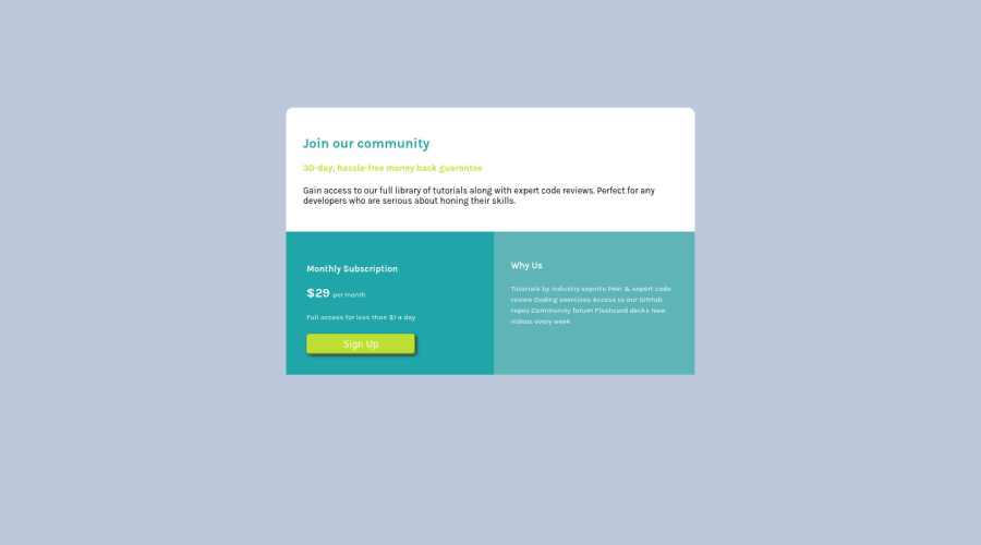
Desktop design screenshot for the Single price grid component coding challenge

This is a solution for...

  • HTML
  • CSS
1newbie
View challenge

Design comparison


SolutionDesign

Solution retrospective


any suggestion... you are welcome

Community feedback

@VCarames

Posted

Hey @abbaskhan349, some suggestions to improve you code:

  • To make easier, just apply the border-radius to the card container along with overflow: hidden and this will create the perfect border-radius for both mobile and desktop view.

  • The “30-day, hassle-free money back guarantee” is not a heading. It should instead be wrapped in a Paragraph Element.

  • The button was created with the incorrect element. When users click on the button they should directed to a different part of your site; that Anchor Element will allow this to happen.

  • Your button needs to have a cursor: pointer and a :hover. You will also want to remove the default border all buttons have.

  • The “Why Us” list should be created using an Unordered List Element along with the List Items Element.

  • It is best practice to have separate files for you HTML and CSS code. It helps keep things organized and make it easier to maintain.

Happy Coding! 👻🎃

0

Account Deleted

Hello @abbaskhan349,

You can add border-radius on your left and right class:

.left{
  border-radius: 0 0 0 10px;
}
.right{
  border-radius: 0 0 10px 0;
}

  • I tried to apply the border-radius on your bottom container but didn't work
  • Remove the background color you have and add this background-color: hsl(204, 43%, 93%); to the body
  • Make sure add media queries for the mobile design as well

I hope this helps you

0

@Djarma12

Posted

Set on class .left: border-radius: 0 0 0 10px; Set on class .right: border-radius: 0 0 10px 0;

0

@VCarames

Posted

@bccpadge

To make easier, just apply the border-radius to the card container along with overflow: hidden and this will create the perfect border-radius for both mobile and desktop view.

1

Account Deleted

@vcarames that definitely works too

0

Please log in to post a comment

Log in with GitHub
Discord logo

Join our Discord community

Join thousands of Frontend Mentor community members taking the challenges, sharing resources, helping each other, and chatting about all things front-end!

Join our Discord