Pure CSS and JS to build FAQ Accordion Main challenge
Design comparison
Solution retrospective
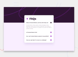
I think the first real challenge is responsiveness with two types of background (both delivered in the assets). I used mobile-first concept.
The title questions are buttons. That was one way that I imagine to solve the click expansion (accordion). Also had to learn about pseudo-elements like ::after to set the plus sign icon.
One big problem I found was when the accordion expands in a window with position absolute. How should I deal with scrollbars, whitespace margin and the content below the FAQs window for better UX design? My way to solve was to use overflow-y: auto inside the FAQs window at a max-height of 560px (above that, we should see a scrollbar).
Something that felt so good to code was the little animation on
transition: .25s;
transform: rotate(180deg);
That is all magic to me! :)
Community feedback
Please log in to post a comment
Log in with GitHubJoin our Discord community
Join thousands of Frontend Mentor community members taking the challenges, sharing resources, helping each other, and chatting about all things front-end!
Join our Discord
