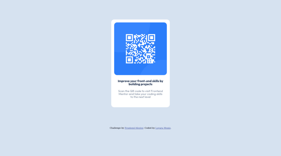
Design comparison
Community feedback
- @christian-prasetyaPosted over 2 years ago
Nice job, mate.
The code is well structured and semantically great.
Area for improvement, maybe can be more detailed with the margin auto centering, cause in the preview site is little bit off center. As for the CSS margin for the card div, maybe you can join the margin: 0 auto; with margin-top: 100px; -> margin: 100px auto; surely will be better for centering the card in the middle of the page.
Once again, nice job, and let's grow together.
Marked as helpful1@luamunizcPosted over 2 years ago@christian-prasetya Oh, wow, I didn't realise this website had a community component but I'm glad it has. Thank you so much for your feedback, I sure will consider your inputs to try and do better in the future!
0@christian-prasetyaPosted over 2 years ago@luamunizc Got your back, mate. Good luck.
0
Please log in to post a comment
Log in with GitHubJoin our Discord community
Join thousands of Frontend Mentor community members taking the challenges, sharing resources, helping each other, and chatting about all things front-end!
Join our Discord
