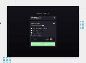
Design comparison
SolutionDesign
Community feedback
- @0xabdulkhaliqPosted over 1 year ago
Hello there 👋. Congratulations on successfully completing the challenge! 🎉
- I have other recommendations regarding your code that I believe will be of great interest to you.
COMPONENT MEASUREMENTS 📐:
- The
width: 100%property forsectionelement is not necessary. because it's a block level element which will take the full width of the page by default.
- Use
min-height: 100vhforsectioninstead ofheight: 100vh. Setting theheight: 100vhmay result in the component being cut off on smaller screens.
- For example; if we set
height: 100vhthen thesectionwill have100vhheight no matter what. Even if the content spans more than100vhof viewport.
- But if we set
min-height: 100vhthen thesectionwill start at100vh, if the content pushes thesectionbeyond100vhit will continue growing. However if you have content that takes less than100vhit will still take100vhin space.
.
I hope you find this helpful 😄 Above all, the solution you submitted is great !
Happy coding!
0 - @NehalSahu8055Posted over 1 year ago
Hello Coder 👋.
Congratulations on successfully completing the challenge! 🎉
Just a small suggestion.
- Replace
heightwithmin-height:100vhin the body to properly center the card and background.
I hope you find this helpful.
Happy coding😄
0 - Replace
Please log in to post a comment
Log in with GitHubJoin our Discord community
Join thousands of Frontend Mentor community members taking the challenges, sharing resources, helping each other, and chatting about all things front-end!
Join our Discord
