Design comparison
SolutionDesign
Solution retrospective
What are you most proud of, and what would you do differently next time?
na
What challenges did you encounter, and how did you overcome them?na
What specific areas of your project would you like help with?na
Community feedback
- @psdesignroPosted 12 months ago
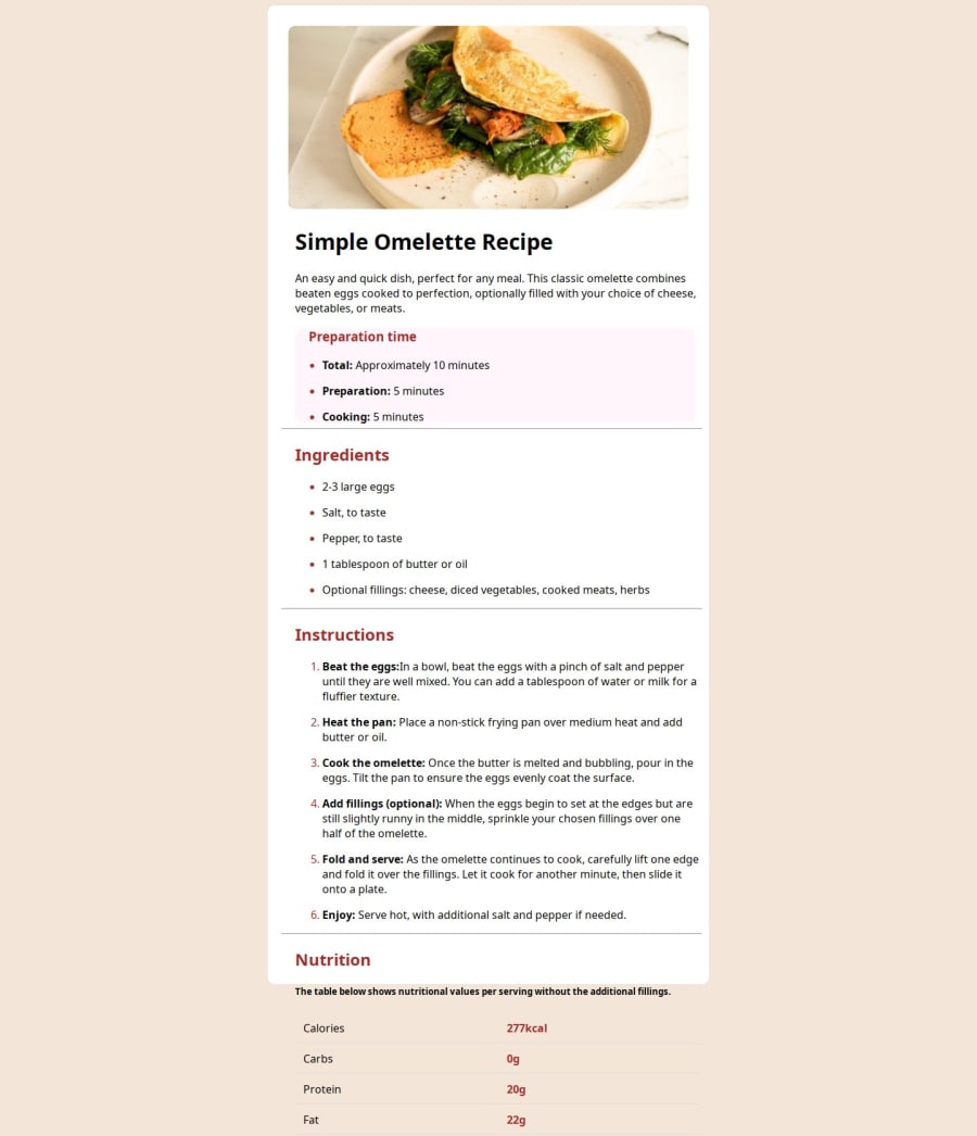
It's a good start, but it looks like you've missed some styling. The heading font is different, the paddings, separator color etc.
Also the table is out of the recipe container. And even if we see it as a tabl, I suggest to use dispay:grid, because it's easirt to write and maintain.
Cheers!
0
Please log in to post a comment
Log in with GitHubJoin our Discord community
Join thousands of Frontend Mentor community members taking the challenges, sharing resources, helping each other, and chatting about all things front-end!
Join our Discord
