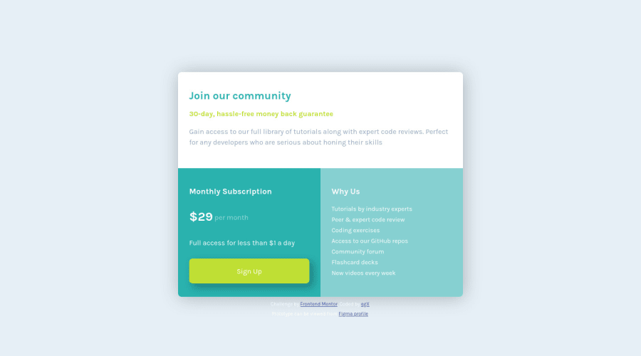
Design comparison
Solution retrospective
Have used Figma (https://www.figma.com/file/nU7ofnmv7fllAfCtEl64aP/SinglePriceGridComponent?node-id=0%3A1) to make prototyping and sizing to match initial .jpg files. As I am just started to work with this service additional feedback appreciated Any feedback and suggestions more than welcome.
Community feedback
- @FaridJuniorPosted almost 4 years ago
Hello Eskender π
it is very good π₯, and it is responsive plus your work in Figma is very good, I read the code and I think it is better to give the container percentage, not static values. For example on-screen with a width of 400px it will leave un-nice space on both sides.
The shadow is very strict, try to make it more smooth, try this shadow generator it will take some time to get familiar with but it very nice.
keep going π
4@egxperiencePosted almost 4 years ago@mohamedfarids Thank you for the feedback Mohamed. Actually it took more than expected for this (basic) project and used exact px values to fit the 'media' settings. Didn't tried percentage as won't sure on how it can react to the settings, but definitely will check it soonest. Additional thanks for feedback regarding Figma - this is my first try so all will come with experience:)
1@FaridJuniorPosted almost 4 years ago@egxperience
you are welcomeπ totally agree with you, all will come with experience.
0 - @grace-snowPosted almost 4 years ago
Hi there
This looks very close to the design now you've fixed the color of the why section, well done
The only odd thing is the large space at the top of the screen on mobile for me, and that's caused by using explicit pixel values.
In future challenges I'd definitely recommend you use fewer media queries and don't set widths and heights on elements. You can use things like flexbox to center content as needed, with a little padding or margin on that container. If you do mobile styles first and use properties like max-width you shouldn't need lots of media queries, maybe just one or two if the layout needs to change a lot as the screen size grows.
Best of luck with it
1
Please log in to post a comment
Log in with GitHubJoin our Discord community
Join thousands of Frontend Mentor community members taking the challenges, sharing resources, helping each other, and chatting about all things front-end!
Join our Discord