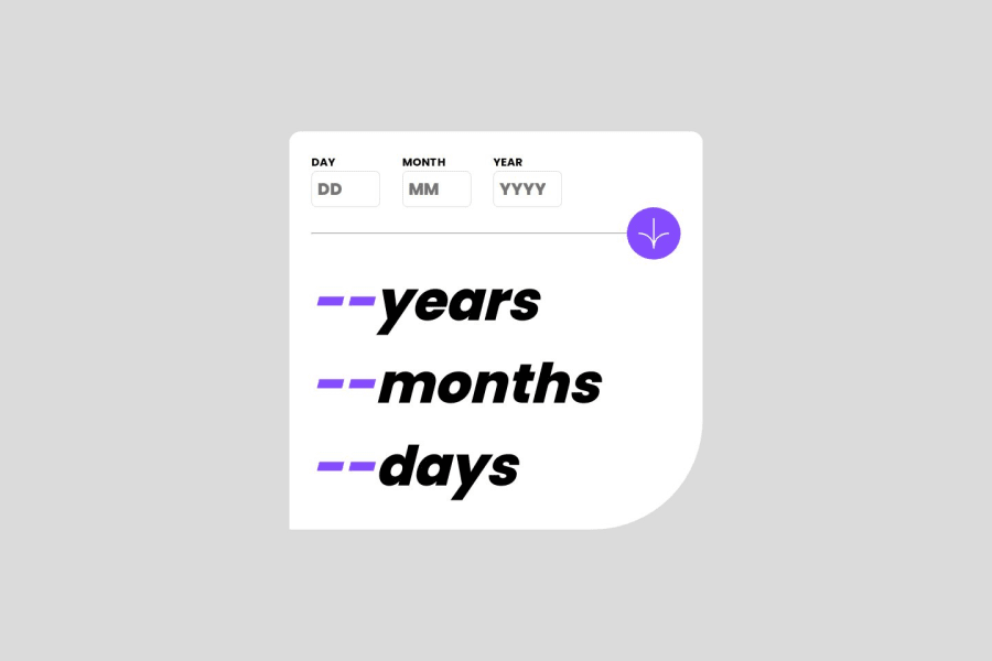
Design comparison
SolutionDesign
Community feedback
- @0xabdulkhaliqPosted 7 months ago
Hello there 👋. Congratulations on successfully completing the challenge! 🎉
- I have a suggestion regarding your code that I believe will be of great interest to you.
MAKING ACCESSIBLE BUTTON :
- Your solution's
button
markup is not accessible for the following reasons:
- Lack of accessible name: The
<button>
element does not have any text content or anaria-label
attribute that describes its purpose or function. Thealt
attribute on the<img>
element inside the button is not an adequate replacement for an accessible name.
- Incorrect use of
<img>
inside<button>
: While it is possible to have an<img>
element inside a<button>
, the<button>
should also have a text label or anaria-label
attribute to provide an accessible name for the button.
- To make the button accessible, you should either add a text label between the opening and closing
<button>
tags or add anaria-label
attribute to the<button>
element that describes its purpose or function.
- Here's an example:
<button type="submit" class="sumbit_btn" aria-label="Click to submit"> <img src="./assets/images/icon-arrow.svg"> </button>
.
I hope you find this helpful 😄 Above all, the solution you submitted is great !
Happy coding!
0
Please log in to post a comment
Log in with GitHubJoin our Discord community
Join thousands of Frontend Mentor community members taking the challenges, sharing resources, helping each other, and chatting about all things front-end!
Join our Discord