Submitted about 3 years ago
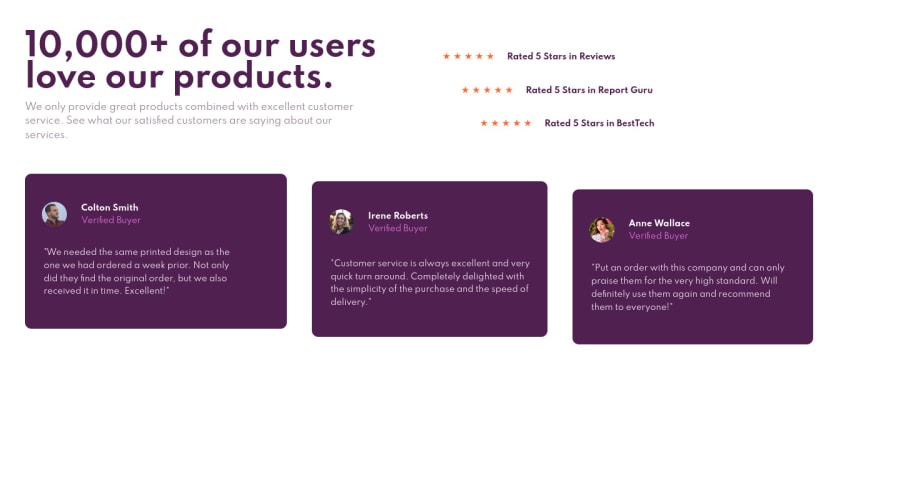
Project-7-Social-Proof-Section using HTML CSS & using Flexbox
@Sundaram218
Design comparison
SolutionDesign
Solution retrospective
Any Suggestions? Thanks!
Community feedback
- @hyde-brendanPosted about 3 years ago
Hey, great start! You handled the most notable part of the design (the offset cards) well, but there's a few immediately noticeable issues I would get on:
- There's no mobile layout; if you reduce the screen size the reviews' cards will overflow off the screen. The general idea for these sorts of things is to design the page for mobile layouts first, then add media queries to change certain CSS properties when the screen size is larger than a given value.
- The background patterns provided in the images folder is missing from your design, as are the background color over the 5-star ratings cards.
- To align the page's content to the middle of the screen one common method is to include the following to your main
bodyelement:
display: grid; place-items: center; min-height: 100vh;- For the Document should have one main landmark and All page content must be contained by landmarks warnings, there's a couple of HTML elements that are treated as the "main landmark", including
header,nav,main, andfooter. For this particular page I would just wrap all your content in a<main>element to resolve that issue. <article>elements should use a heading element to identify the content for it. You can resolve this on.reviewedby making the names of the reviewers a<h2>.
Hope this helps!
0
Please log in to post a comment
Log in with GitHubJoin our Discord community
Join thousands of Frontend Mentor community members taking the challenges, sharing resources, helping each other, and chatting about all things front-end!
Join our Discord
