Design comparison
Solution retrospective
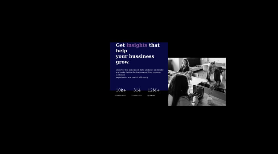
I am yet to do the responsiveness of this project because I do not really know how to go about it.
can someone please help me out with it? Thanks.
Community feedback
- @DanielGrecPosted over 2 years ago
Hi Victor! Congrats on working towards making better designs!
I'm pretty new to this, but you should try to use 'flexbox' so you can get two even sides in which you can put your content. You can also center the actual component using 'flexbox' aswell, adding it to the body.
If you wanna learn more about Flexbox, research on devdocs.io or any other source. Hope I could help with the little knowledge that I have. Keep up the good work and whenever you're stuck, just google it!
0 - @correlucasPosted over 2 years ago
Hello Victor, congratulations for your design.
I'm with your live site open and I've some tips for your:
1.Use the proper color for the card background:
hsla(276, 60%, 61%, 1)
. 2.Add border-radius to your componentborder-radius: 12px;
this will make your card rounded. 3.Add to the bodyheight: 100vh;
to keep your card fullscreen and have a better alignment. 4.Import the font using the html or css, you can do it ussing Google Fonts and choosing the proper font and drop the code inside the html/css. Here's the code for the css font:@import url('https://fonts.googleapis.com/css2?family=Inter:wght@400;500;700&family=Lexend+Deca&display=swap');
I hope it helps you and keep coding! Feel free to ask me any question.
0
Please log in to post a comment
Log in with GitHubJoin our Discord community
Join thousands of Frontend Mentor community members taking the challenges, sharing resources, helping each other, and chatting about all things front-end!
Join our Discord