Submitted almost 3 years ago
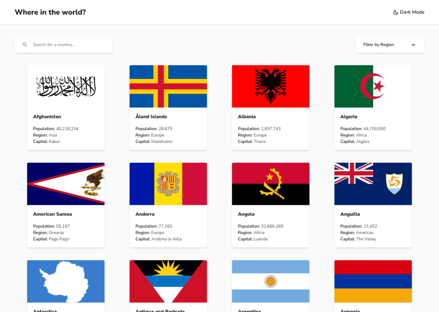
Project with responsive searching component.
#axios#react#tailwind-css#typescript#material-ui
@kerminek
Design comparison
SolutionDesign
Solution retrospective
Hi, I've made this project using a few of new for me technologies:
- tailwind.css
- react-spring
- react-virtualized
I started project with typescript, but i did't use it as much as i could, definitely will be using it more in the future. I think that most interesting part is smooth searching functionality, because as i saw, people usually submit solutions with search bar that is lagging our app when rendering a lot of new country-tile components. Dark mode functionality was made using tailwind. App is fetching data only once, then it's stored using react context. Please let me know your opinions. Would appreciate all the feedback :)
Community feedback
Please log in to post a comment
Log in with GitHubJoin our Discord community
Join thousands of Frontend Mentor community members taking the challenges, sharing resources, helping each other, and chatting about all things front-end!
Join our Discord
