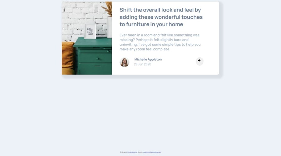
Design comparison
SolutionDesign
Solution retrospective
What are you most proud of, and what would you do differently next time?
That i could do this project, was difficult but i could do this
What challenges did you encounter, and how did you overcome them?i encountered some challenges refered to reacreate the design but was a good deal
What specific areas of your project would you like help with?how i can do this to work in any screens? Who is the best way to do this project?
Community feedback
- @Grimm-NPosted 5 months ago
Great job on your project—it’s looking amazing! The effort and creativity you’ve put into this really shine. 🌟
A few quick suggestions to take it to the next level:
- The inline styles in your HTML are just for demonstration purposes. Move them into your CSS file to keep things tidy and easier to maintain.
- Pixels are kinda old-school! Using units like
em,rem, or percentages gives your design more flexibility and makes it way more responsive. - To center an element like in the design, try using Flexbox for the container:
.container { display: flex; justify-content: center; align-items: center; height: 100vh; /* Example height */ } - For medium-width screens, consider switching to the mobile layout (like placing the image on top) a bit earlier. And don’t forget, you can use responsive typography by adjusting the text size gradually with media queries or
clamp().
You're absolutely crushing it—keep up the awesome work!
1
Please log in to post a comment
Log in with GitHubJoin our Discord community
Join thousands of Frontend Mentor community members taking the challenges, sharing resources, helping each other, and chatting about all things front-end!
Join our Discord
