Design comparison
SolutionDesign
Solution retrospective
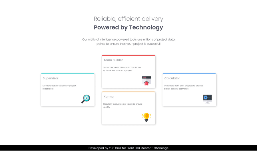
making him responsive was hard, I couldn't.. could give me a tip and recommend a site to study better about? thanks! all feedbacks re welcome (:
Community feedback
- @VCaramesPosted about 2 years ago
Hey @yuuricrz, regarding you question:
- You want to use responsive properties and media queries to make your content responsive. Here is a link that will teach you how:
Some suggestions to improve you code:**
-
The heading is one single heading so the entire thing should be wrapped in a single <h1> Heading along with a Span Element.
-
Using CSS Grid with Grid-Template-Areas will make things way easier when building the layout; it will give you full control of the layout.
Here is an example of how it works: EXAMPLE
Desktop View Code:
.card-container { grid-template-columns: repeat(3, 1fr); grid-template-rows: repeat(2, 1fr); grid-template-areas: "supervisor team calculator" "supervisor karma calculator"; } .karma-card { grid-area: karma; } .calculator-card { grid-area: calculator; align-self: center; } .team-card { grid-area: team; } .supervisor-card { grid-area: supervisor; align-self: center; }
Happy Coding! 👻🎃
0
Please log in to post a comment
Log in with GitHubJoin our Discord community
Join thousands of Frontend Mentor community members taking the challenges, sharing resources, helping each other, and chatting about all things front-end!
Join our Discord