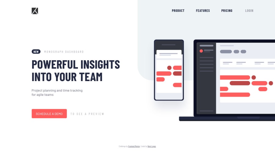
Design comparison
SolutionDesign
Solution retrospective
I added an extra menu when you click on the "Schedule" button where you can choose a date ! Feel free to give me any feedback about my code (:
Community feedback
- @tedikoPosted over 3 years ago
Hello, Lpz! 👋
Congrats on finishing another challenge! 🎉 Your solution looks very good and also responds well. Here's my few tips:
- Add
:focuspseudo class to interactive elements like anchors, buttons etc. Useoutlineproperty to make your website more accessible to keyboard users. Focusable elements like anchor, buttons or inputs they have applied default:focuspseudo class withoutlineproperty. These default styles are subtle and hardly visible tho. Furthermore every browser has a slightly different default style for the outline, so you probably want to change the default style. Read more about why we should change focus styles. - Change the
altattributes for the.logoimage, as it doesn't add any extra context for screen reader users. Since your image is decorative youralttext should be provided empty (alt="") so that they can be ignored by assistive technologies. - Read about semantic. Semantic elements lead to more consistent code, they are easier to read and improve accessibility.
Good luck with that, have fun coding! 💪
Marked as helpful1@ZepolimerPosted over 3 years ago@tediko
Hey, thanks a lot for your tips Tediko ! I'll remove the "alt" of my ".logo" and find a solution for my button and input when they're focused
Thanks again for your advices (:
0 - Add
Please log in to post a comment
Log in with GitHubJoin our Discord community
Join thousands of Frontend Mentor community members taking the challenges, sharing resources, helping each other, and chatting about all things front-end!
Join our Discord
