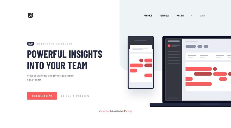
Project Tracking solution with javascript mobile navigation
Design comparison
Solution retrospective
Updated my solution on 6/29/21 to incorporate feedback from comments and a few new tricks I've learned since I originally submitted this solution.
Leave a comment below with a rating of 1-10 on my design or code (10 being the highest compliment).
Community feedback
- @codeswithrohPosted over 3 years ago
There are a lot of things that needs to be addressed here.
-
You have not created a nav for the desktop version
-
Your main content is not bound by flex or grid. That is why it fails the cross-browser test.
-
Don't use large pixel values instead of that use rem or em, its much more responsive
-
The positioning of almost all your elements is done by margin. Although that is good but when the components are in flexbox or grid. Positioning the element with only margin will mess up the positions across different screens.
-
You should add a hover effect on the nav-links. Although its my personal opinion.
One of the article that helped me with responsiveness is https://learn.shayhowe.com/advanced-html-css/responsive-web-design/
Hope, you will learn something from it as well.
Happy coding :-)
2@SheGeeksPosted over 3 years ago@codeswithroh
-
I actually do have a nav menu for desktop. Not sure how you're missing it (unless this is a cross-browser issue). I primarily use Firefox and the navigation for both mobile and desktop shows up fine for me (also tested Microsoft Edge). Are you using Chrome?
-
Not sure which cross-browser test you're referring to. I know it's good practice, and I did test across the browsers I use if that's what you were trying to share. Less concerned about cross-browser compatibility for these challenges at the moment though.
-
In my Github README for this project, I noted the reason for using pixel values instead of rem or em. There's a mix of both in this project and most of my FEM solutions in order to get as close to the intended design as possible. Please read that for more clarity on why I don't stick with rem/em and what I might do differently in the future. Responsive units are helpful, but can also behave in unwieldy ways. So, I'm selective of when I use them.
-
Positioning is at the top of my study list right now. I'm more comfortable using margins, but appreciate the insight into how this can backfire in the future. Thus far this hasn't been an issue. 👍🏿
-
Applying a hover effect to the menu is on my extra credit list. ✔
Appreciate the feedback *Roh! My apologies for misnaming you. I replied at a late hour where I am and mistook the link you shared as your work.
0 -
- @pikapikamartPosted over 3 years ago
Hey, well, @codeswithroh already mentioned key point, but there is also one suggestion from me.
Maybe you could lower down the media breakpoint so that users, like me, with lower dimension could see the desktop layout properly and not directed to the mobile view first.
Also making the content in mobile view, not touching the flooring of the viewport
Just that and good work^^
0@SheGeeksPosted over 3 years ago@pikamart Appreciate your reply! I think both comments are going to motivate me to do some cross browser testing on this solution and moving forward. Would love to get your thoughts on my replies to Shay if you have anything to add in response.
I think working with a 4K screen doesn't help either since everything is so tiny (to me) on the screen. Definitely going to start cross-browser testing before submitting future challenges and will use that as a starting point to revise this one.
Thanks again to you and Shay for the feedback!
0@pikapikamartPosted over 3 years ago@SheGeeks Sure, would love to give some thoughts about it.
-
For the second query, regarding the flex or grid. Well, it depends really on how we build, if we are comfortable and can, make the layout without having to use
flex
orgrid
well, it is really fine and nothing wrong with that. It means that you are well aware of things, when to use them and where right. But a suggestion for the image on your main content, maybeposition: fixed
is not the right way, because when a user inspect it, when the user scroll, the images stays on the screen and can somehow bother some. Also, it would be great if you omit theoverflow: hidden
in the body tag. You don't need that for this one, since you useposition: fixed
, but it it is absolute or relative, then you may have to use that. -
Well I use pixels here as well hahaha because like you, want to be pixel perfect and don't want to compute every other units into rem, but making sure that I always do it the right way when i'm building in my freelances.
-
Margins are fine hahahaha I use them in my grids, flex, very often. But if I can copy the layout with just using
gap
then I go with it instead of margins, just make sure that you want to gap the right components. Nothing wrong with using margins, as long as you maintained it right, well, that's good, if it doesn't well that is bad. Right.
Hmm, I don't know hahaha haven't experienced such a wide screen. But yeah, I think, well an opinion, it is hard to layout I guess since it is very big and, so you need to look at dev tools a lot to know which dimension are you in right now
Btw, who is Shay
0@codeswithrohPosted over 3 years ago@SheGeeks that's my question too, who is Shay ? 😂
0@SheGeeksPosted over 3 years ago@codeswithroh 😅 My apologies Roh! I corrected that part of my comment and noted why that happened. Appreciate you and @Pikamart for being kind about it. Sincere brain fart from responding at a late hour.
0@SheGeeksPosted over 3 years ago@pikamart See my reply to Roh above on misnaming him. 😅
-
Are you referring to
row-gap
(grid-row-gap
)? One reason I've avoided using those is because the spacing is evenly applied. The layouts on FEM don't always have a sense of repetitive spacing throughout. That's another reason I will default to usingmargin
. -
Maybe another way for me to think about using
gap
would be to apply it to specific sections/containers to get the control I'm looking for. The potential downside to this is forcing all those containers to be flexboxes or grids, which I'm not sure I like the idea of. Definitely something to think about though. -
Lastly, I am typically working in dev tools responsive mode when creating my FEM challenge solutions with the sizing set to the mobile or desktop widths from the style guide depending on which layout I'm working on. Receiving feedback like this makes me question how useful this actually is.
Thanks for the added feedback!
0@pikapikamartPosted over 3 years ago@SheGeeks hahahah that part was funny.
-
Yep, the challenge here most of them does not have an even spacings. But why do I use still gaps? Well, imagine a flex container, who have 4 child on it. The spacing at the bottom is the same for 3, but the one is different. So what I do is that, I use gap, mainly to give space for those 3 and add a bit or margin that will be added to the other one to align them pixel perfect. That way, you avoided declaration of multiple margin in multiple elements. Minifying things up.
-
I only use flex if I really needed them, but for a fast layout, flex and grid is very good.
-
Well, most FEM challenge here is the design responsive at 375px for mobile right, well that is just the design, if there are parts where element seems not right or distorted, well, adding breakpoints for that part is a really good idea. Because if you stick at the provided pixel, then you left out with a layout with unwanted elements overlapping or making scrollbars right
Thank you as well ^
1 -
Please log in to post a comment
Log in with GitHubJoin our Discord community
Join thousands of Frontend Mentor community members taking the challenges, sharing resources, helping each other, and chatting about all things front-end!
Join our Discord