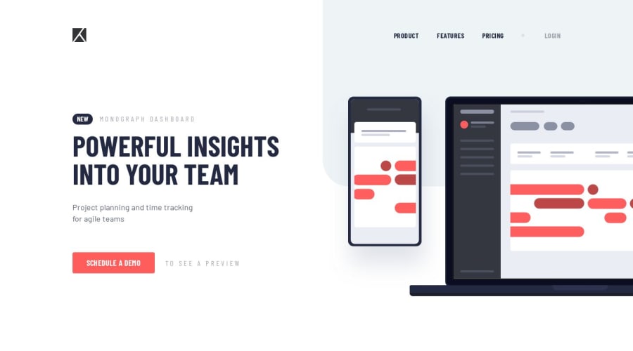
Design comparison
Community feedback
- @mattstuddertPosted over 4 years ago
Amazing work, Alex! Basically 1:1 with the design. Your solution scales down really well to mobile too. Did you learn anything new while working through the project?
Keep up the awesome work! 👍
0@alex-kim-devPosted over 4 years agoThanks, Matt!
The hardest part for me was to make the menu with css which shows its links on bigger screens and hides them under a hamburger on smaller ones. This pen helped me understand how it all works, but I ended up doing it a little bit different.
Also I've learnt how to do that pretty animation - when the hamburger transforms to a the cross mark on click.
Each challenge always pushes me to learn something new 💪
0@mattstuddertPosted over 4 years ago@Alex-K1m nice! Yeah, there's always something new to learn. Thanks for all the feedback and support you've been giving to others as well. You've been giving lots of other people some great support! 🙂
0
Please log in to post a comment
Log in with GitHubJoin our Discord community
Join thousands of Frontend Mentor community members taking the challenges, sharing resources, helping each other, and chatting about all things front-end!
Join our Discord
