Submitted over 4 years ago
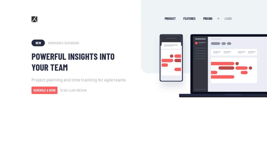
Project tracking intro component Mobile First & Flexbox
@gulayyolcu
Design comparison
SolutionDesign
Solution retrospective
feedback is always welcome..
Community feedback
- @gulayyolcuPosted over 4 years ago
thank you for your comment,i will care about this after that:)
0 - @lailton-bPosted over 4 years ago
Hello, Gülay Yolcu!
One problem I saw was the @media (max-width: 1440px) and (min-width: 961px)
When the screen goes over 1440px the layout breaks completely. Try removing (max-width: 1440px) and leaving only (min-width: 961px), this will prevent the site from breaking on larger screens.
Ex: @media (min-width: 961px) { content }
0
Please log in to post a comment
Log in with GitHubJoin our Discord community
Join thousands of Frontend Mentor community members taking the challenges, sharing resources, helping each other, and chatting about all things front-end!
Join our Discord
