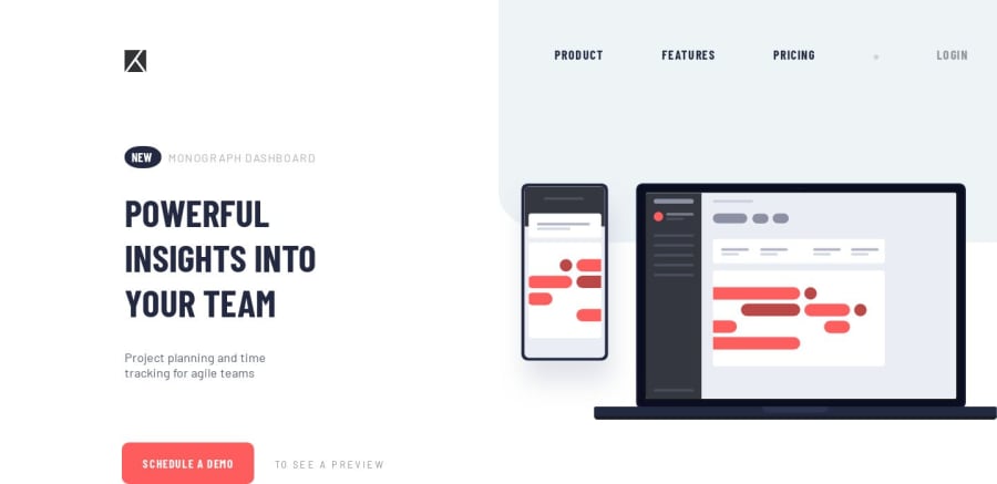
Design comparison
Solution retrospective
I need a feedback on that page about zooming (in & out) the page , Thanks.
Community feedback
- @mattstuddertPosted almost 5 years ago
Nice work on this challenge! It looks great on desktop. When you mention "zooming in and out" do you mean responsiveness? Or actually zooming the page in and out?
0@hanay0Posted almost 5 years ago@mattstuddert Thank you so much for your feedback , it made my day
-I mean about zooming in & out ( the content of the page ) and it's positions after zooming. Thanks Matt.
0@mattstuddertPosted almost 5 years ago@hanay0 no problem. If you add media queries to make the site responsive zooming the content in should start triggering the media queries. If you zoom in on this page, for example, you'll see that it gradually changes to the mobile design.
1@hanay0Posted almost 5 years ago@mattstuddert Alright matt , Thank you so much I will go with media queries and bootstrap.
0
Please log in to post a comment
Log in with GitHubJoin our Discord community
Join thousands of Frontend Mentor community members taking the challenges, sharing resources, helping each other, and chatting about all things front-end!
Join our Discord
