Submitted 3 months ago
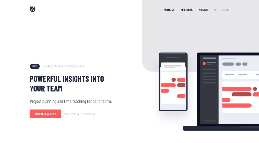
Project tracking intro component
#accessibility

@YacoubDweik

Design comparison
SolutionDesign

Community feedback
- @jessiicacmoorePosted 3 months ago
Hello Yacoub, sorry for taking so long to review this!
Really great work, I can tell that you've been learning semantic HTML like you said!
Here's my feedback:
- I wouldn't put a
<header>inside<main>like this. Including a<header>in<main>can confuse assistive technologies and screen readers that rely on a clear document outline- With this design, I'd wrap the logo and navigation in the <header> and use styling to position it over
- There are exceptions to this though, you can have a
<header>inside<main>if it's the header of a specific<article>
- You have an
<h2>that comes before the<h1>of the page, these should be in sequential order. Screen readers and assistive technologies use this hierarchy to provide an outline of the page for users.- Even though visually "Powerful insights into your team" looks like an
<h1>because It's bigger, I think "New Monograph Dashboard" makes more sense as the main title<h1>because it's the name of the product and better describes the purpose of the page. - If the design doesn't have something else that makes sense as the main title of the page, and changing the design isn't an option - a common solution is to add a visually hidden
<h1>
- Even though visually "Powerful insights into your team" looks like an
- Similar to the above, I don't think it's necessary to have "to see a preview" inside an
<h3>. It might be a little confusing to hear a partial sentence if a screenreader user is skimming through the titles of the page- I might mark up that small section like the example below so someone using a screenreader can hear the additional "to see a preview" if they're just tabbing through
<p> <a href="#" class="cta-button" aria-describedby="cta-context"> Schedule a demo </a> <span id="cta-context">to see a preview</span> </p>- I think the aria-live region isn't necessary to announce the menu open/closed state.
aria-expandedshould be doing this.- I would also avoid using
aria-live="assertive"whenever possible and instead favoraria-live="polite" aria-live="assertive"interrupts users immediately to announce changes, whilearia-live="polite"waits until they're idle to announce updates, ensuring less disruption.
- I would also avoid using
- I would find a different way to style that decorative dot on the desktop nav such as a psuedo element on one of the nav items, as it's currently adding to the count of list items that you hear when you using a screenreader.
Some additional opportunities for going above and beyond if you want the extra challenge:
- The design doesn't have this, but it's a pretty common pattern to have a "Skip to main content" link that is the first item on the page and visually appears when in keyboard focus
- With a mobile navigation that sits overtop page content like this when open, it's a good idea to add a focus trap to ensure the user can't tab to the main content of the page while the menu is open and might obstruct their view of the main content. It's hard to explain so I hope this article helps 🤣
Overall, this is really well done though, I'm impressed with the cleanliness and organization of your code!
Marked as helpful2@YacoubDweikPosted 3 months ago@jessiicacmoore I can't thank you enough Jessica! I enjoyed just reading your lovely comprehensive feedback! all your points make a huge sense! and I can't be more excited to apply all what you have said here, thanks a million!
0 - I wouldn't put a

Please log in to post a comment
Log in with GitHub
Join our Discord community
Join thousands of Frontend Mentor community members taking the challenges, sharing resources, helping each other, and chatting about all things front-end!
Join our Discord