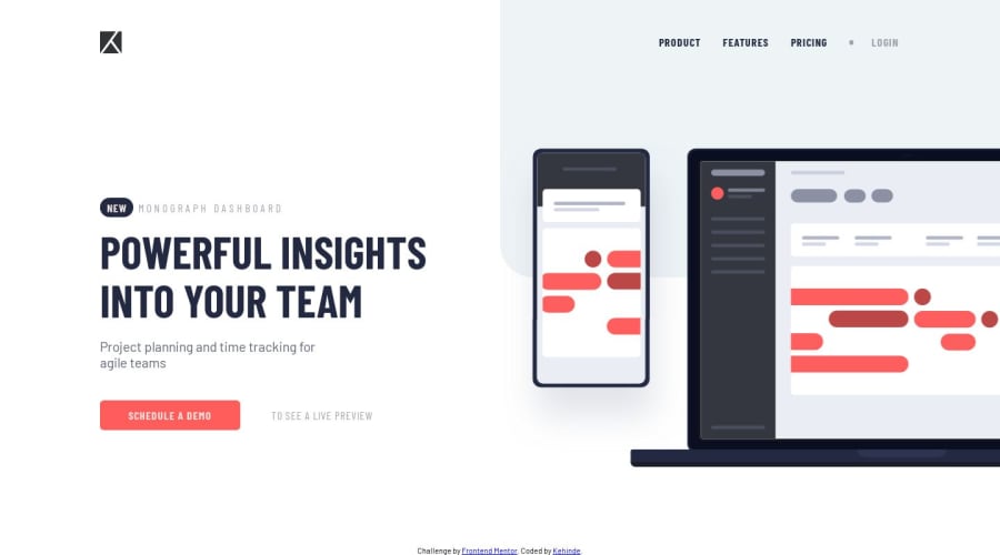
Design comparison
SolutionDesign
Solution retrospective
Hey there, thanks for checking out my challenge. This little project taught me a lot about positioning elements on a webpage. I'll really love to hear from you. How could I improve this solution ? 🤔. One of the challenges which I still haven't completely solved yet is how to make the site look good on tablet screens. Your feedback would be appreciated.
Community feedback
Please log in to post a comment
Log in with GitHubJoin our Discord community
Join thousands of Frontend Mentor community members taking the challenges, sharing resources, helping each other, and chatting about all things front-end!
Join our Discord
