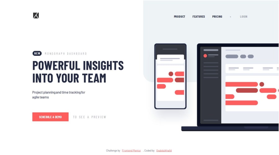
PROJECT TRACKER INTRO COMP 🎯 [ ACCESSIBLE - ES6 - BEM - VANILLA CSS ]
Design comparison
Solution retrospective
👾 Hello, Frontend Mentor Community,
This is my solution for the Project Tracker Intro Component.
- Scored
98.4%on Google Pagespeed Insights! 🤩 - Added outline for interactive elements like
buttons,ato ensure better accessible solution - Minified the
css&jsfiles to improve site performance 🚀 - Used
Prettiercode formatter to ensure unified code format ⚙️ - Layout was built responsive via mobile first workflow approach 📲
- Had a lots of fun while building this challenge ! 🤠
- Feel free to leave any feedback and help me to improve my solution 💡
Thoughts :
- My primary goal during building this project is to build it accessible as much as possible. In the end i figured about how we can make accessible hamburger menu for Mobiles without affecting the horizontal menu for Desktops.
- The Hamburger menu for mobile will support
Enter,Space,↓to open the menu, and then we can use↓to traverse the menu items. - Used
inclusive-menu-buttonscript byHeydonto quickly implement these functions. Actually this script was build for dropdown menu, in our case we use for Hamburger menu. - The edge case i faced is to apply implement these logics on for mobile devices, so that i added conditionals to watch
windowsize whether it's mobile or not & useswatchMediaapi to set these logics otherwise the logics won't be applied - The
watchMediais not added as a eventListener, So if you try to switch Desktop to mobile in RWD Mode then the Hamburger menu will won't work, I'll try to add an event listener for that - Feedback regarding these implementations are also welcome!
.
👨🔬 Follow me in my journey to finish all junior challenges to explore solutions with custom features and tweaks
Ill be happy to hear any feedback and advice !
Community feedback
- @SalahShadoudPosted almost 2 years ago
nice work here mate <3
- i think the menu button is not working :')
- for the
attribuation divthey gave with the file, i always make itsposition: absoultebottom: 0left: 50%transform: translateX(-50%)so i can get rid of the overflowing by the y-axis
keep up the hard work man <3
1@0xabdulkhaliqPosted almost 2 years agoGlad to hear your suggestions @SalahShadoud!
- I already mentioned in my this questions post that the menu will won't work if you try to switch Desktop to Mobile in RWD Mode, which means the JavaScript file can only identify the user's device on the initialization of web application.
- So you can try the menu after entering RWD Mode, just refresh the site once you enter Desktop to mobile. Now you can use the Hamburger menu
- You can try to Hit
tab,enterlike keys to test the accessibility of Menu
- And regarding the
translateproperty forattribution, Without the styles i applied i can't make the desired output, becausetranslatecomes handy. if i useleftthen i still need to adjust some extra stuffs.
- PS: Salam alaykum warahmatullahi wabarakatuh
Thank you for reviewing my Code, Happy Coding!
1@SalahShadoudPosted almost 2 years ago@0xAbdulKhalid
aahh i see now Good Luck Mate Salam alaykum warahmatullahi wabarakatuh <3
0 - @marcosaurelioslPosted almost 2 years ago
Parabéns, excelente resultado.
1@0xabdulkhaliqPosted almost 2 years agoThanks for checking out and sharing you thoughts regarding this solution @marcosaurelios
1
Please log in to post a comment
Log in with GitHubJoin our Discord community
Join thousands of Frontend Mentor community members taking the challenges, sharing resources, helping each other, and chatting about all things front-end!
Join our Discord
