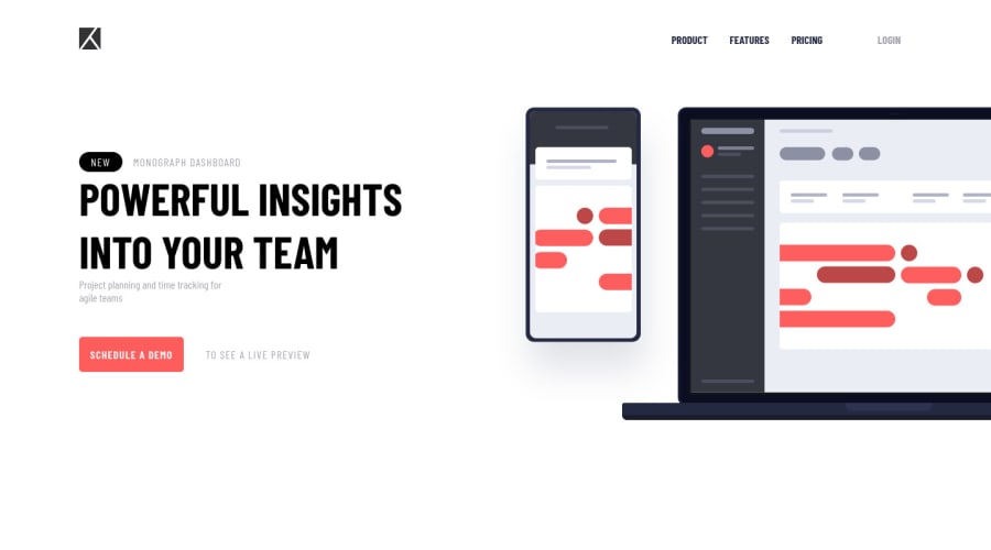
Design comparison
SolutionDesign
Solution retrospective
Completed the challege after long time, learned a lot in between. So, any feedback provided will be great to take it to the next level
Community feedback
- @RioCantrePosted over 2 years ago
Hello there! Great work with this one. Regarding the solution you submitted, I think you should know the following notes…
- Remove unnecessary code to keep it clean
- Clean the whitespaces in the code
- If you based it on the original design, include the background image in the
bodyrule set.
In the brighter side...
- Well done in using Sass for styling. A plus on utilizing separate files from components to specific section. The compositions are well organized
- Proper usage of semantic tags and added commented description in each part
- The project is responsive and great use of alignments.
- The hover state is functional, specially the hamburger menu
- The details are utilized based on the original design
Above all, The project is awesome! Keep it up!
Marked as helpful1@Skyz03Posted over 2 years ago@RioCantre Thanks man, really appreciate your feedback ✌
0
Please log in to post a comment
Log in with GitHubJoin our Discord community
Join thousands of Frontend Mentor community members taking the challenges, sharing resources, helping each other, and chatting about all things front-end!
Join our Discord
