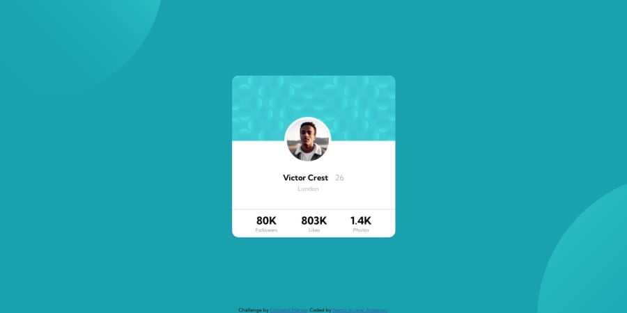
Design comparison
Solution retrospective
I am still learning about these additional function with background images. How do I get the two images to exactly where I want it?
Community feedback
- @danielmrz-devPosted 12 months ago
Hello @nemoanderson!
Your project looks great!
If you want to nail the exact position of the background pattern, here it is:
background-color: var(--Dark-cyan);
background-image: url("./images/bg-pattern-top.svg"), url("./images/bg-pattern-bottom.svg");
background-repeat: no-repeat, no-repeat;
background-position: right 52vw bottom 35vh, left 48vw top 52vh;
I hope it helps!
Other than that, great job!
Marked as helpful0 - @MelvinAguilarPosted 12 months ago
Hello there 👋. Good job on completing the challenge !
-
Unfortunately, positioning the circles is a trial-and-error process. You can use this code to position them like the design; using
vhandvwmakes it a bit more responsive.background-position: right 52vw bottom 35vh, left 48vw top 52vh;This positions the two elements separated by a comma, and using vw and vh ensures they resize appropriately regardless of the device.
I hope you find it useful! 😄
Happy coding!
1 -
- @nemoandersonPosted 12 months ago
Finally got the card size right. inside content, not so much.
"Knowledge is power. Information is liberating. Education is the premise of progress, in every society, in every family. " -- Kofi Annan
1
Please log in to post a comment
Log in with GitHubJoin our Discord community
Join thousands of Frontend Mentor community members taking the challenges, sharing resources, helping each other, and chatting about all things front-end!
Join our Discord
