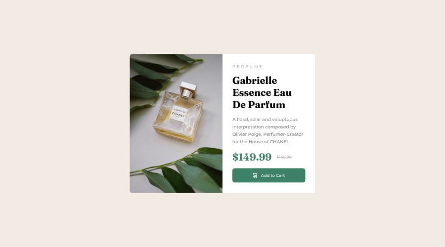
Design comparison
Solution retrospective
Hello. To whoever's reading, if you have the time, please check out this recreation of a design from this website.
-The part i found hardest was getting the website to be responsive. Almost all options i tried always ended up in an undesirable result
- Another thing is measurements. Ive always not known how to use them. or when its appropriate to use rem, em, percentage or pixels.
I am very new to this so any feedback and tips will be greatly appreciated. Thank you
Community feedback
- @AbraCadabstraxPosted over 1 year ago
Hello, there is a broken link to the code source for your project. Now, this may be my issue as a user or you may have done something like delete the repository or change its name. Either way it makes it hard to provide useful feedback.
That said, the preview looked pretty good. So, if anything, the end result is ok.
Marked as helpful0@iamis15Posted over 1 year ago@AbraCadabstrax I just realised the repo was set to private. Hopefully it works now. Thanks for the heads up
0 - @TanDevvPosted over 1 year ago
Hello, iamis15. Great work on this one! Let's talk about a few things in the accessibility report. :)
📝HTML:
- Document should have one main landmark | All page content should be contained by landmarks
After your body tag, consider adding landmarks such as, <nav>, <main> and <footer> as a parent to the corresponding content (such as your
div
with theid=root
) where it makes sense. This helps keep your HTML organized and accessible for users using screen-readers, so a win-win for everybody.(For more information on what is semantic markup, you can read this article by MDN)
- Heading levels should only increase by one
Ensure all your headings
<h1>
to<h6>
are in a logical order. Try to always start from<h1>
, followed by<h2>
and so on.This is good practice for not only general organization of your page but importantly for users of screen reading software as they may want to jump from different headings to quickly determine the content of the page.
Not doing so may create confusion, as the user navigating this way may be left wondering where the missing heading is!
(For more information regarding Headings and how to write them, you can read this article also by MDN)
- Images must have alternate text
Ensure all your
<img>
elements have short, descriptive alternate text such as,<alt="drawing of a cat">
as it is incredibly useful for accessibility; screen readers will read youralt
description out to their users so they know what the image means.Alt text is also displayed on the page if the image can't be loaded for some reason: for example, network errors, content blocking or links expiring.
For other elements such as icons or images that are purely decorative that hold no meaningful content, you can give it an empty
<alt>
description so screen-readers will ignore it!(For more information regarding
<alt>
, you can read this article also by MDN)PS: Your repository link seems to be coming up as Page Not Found, is your repository set as public? :)
I hope you find this information helpful. Above all, your solution is great, well done! 😄
0 - @Finney06Posted over 1 year ago
Hello there 👋. Good job on completing the challenge !
Here are some suggestions regarding your code that may be of interest to you.
HTML 🏷️:
To clear the Accessibility report:
- Images should have alternate text.
<img src="images/icon-memory.svg" alt="memory icon">
this provides alternative text descriptions of images for people who are visually impaired and rely on screen readers to navigate the web. Screen readers can read the alt text aloud, enabling these users to understand what the image represents and how it relates to the content on the page. Overall, including alt text in HTML is an important best practice for creating accessible and user-friendly web content. - Wrap the page's whole main content in the
<main>
tag. - Always avoid skipping heading levels; Starting with
<h1>
and working your way down the heading levels (<h2>
,<h3>
, etc.) helps ensure that your document has a clear and consistent hierarchy.
I hope you find it helpful!😏 Above all, the solution you submitted is 👌. 🎉Happy coding!
0 - Images should have alternate text.
Please log in to post a comment
Log in with GitHubJoin our Discord community
Join thousands of Frontend Mentor community members taking the challenges, sharing resources, helping each other, and chatting about all things front-end!
Join our Discord