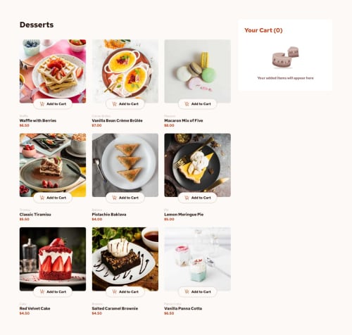
Submitted about 1 year agoA solution to the Product list with cart challenge
Project MTD
react, sass/scss, vite, styled-components
@Paloma-Cruz

Solution retrospective
What are you most proud of, and what would you do differently next time?
I am proud of the project's fidelity to the proposed designer.
What challenges did you encounter, and how did you overcome them?I didn't encounter any challenges in this project, other than the fact that I didn't have a Figma designer to guide me. The solution was to use other means, including Figma's own tools to extract information from the example images I had.
What specific areas of your project would you like help with?Which took me more time, as I'm not used to deploying using GitHub pages.
Code
Loading...
Please log in to post a comment
Log in with GitHubCommunity feedback
No feedback yet. Be the first to give feedback on Paloma-Cruz's solution.
Join our Discord community
Join thousands of Frontend Mentor community members taking the challenges, sharing resources, helping each other, and chatting about all things front-end!
Join our Discord