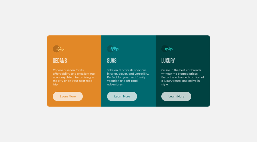
Design comparison
Solution retrospective
On this challenge i started by the mobile version then made the desktop version and used "rem" instead of "px". Both was suggestion of one member from here. All feedbacks are welcome!
Community feedback
- @VCaramesPosted about 2 years ago
Hey there!👋 Here are some suggestions to help improve your code:
-
Reduce 📉 the
border-radius
to better match the FEM example. -
Add more
padding
to the cards to increase their height. -
Along with the Blank Alt Tag, you also want to include the aria-hidden=“true” to your car images/icons to fully remove them from assistive technology.
-
The headings in your component are being used incorrectly. Since the <h1> Heading can only be used once, it is always given to the heading with the highest level of importance. This component has three headings of equal importance, so the best option would be to use an <h2> Heading, since it is reusable and it will give each heading the same level of importance.
-
Adjust the
padding
andfont-size
of the component as the screen size decrease to better accommodate the smaller screen size. -
Implement a Mobile First approach 📱 > 🖥
With mobile devices being the predominant way that people view websites/content. It is more crucial than ever to ensure that your website/content looks presentable on all mobile devices. To achieve this, you start building your website/content for smaller screen first and then adjust your content for larger screens.
If you have any questions or need further clarification, let me know.
Happy Coding! 👻🎃
0 -
- @correlucasPosted about 2 years ago
👾Hello Yuri, Congratulations on completing this challenge!
Great code and great solution! I’ve few suggestions for you that you can consider adding to your code:
- The icon doesn’t have an important role when you think about semantics and the html structure. So you can add
aria-hidden=“true”
to avoid it being found and read in the accessibility mode/screen readers. These are only decorative items. - Use
max-width: 100%
for the cards in the mobile version to allow the cards grow 100% of the width considering the paddings and avoid to have a lateral gap (limited by a fixed width). - To make your CSS code easier to work you can create a
single class
to manage the content that is mostly the same for the 3 cards (paddings, colors, margins and etc) and another class to manage the characteristics that are different (colors and icon), this way you'll have more control over then and if you need to change something you modify only one class.
✌️ I hope this helps you and happy coding!
0 - The icon doesn’t have an important role when you think about semantics and the html structure. So you can add
Please log in to post a comment
Log in with GitHubJoin our Discord community
Join thousands of Frontend Mentor community members taking the challenges, sharing resources, helping each other, and chatting about all things front-end!
Join our Discord