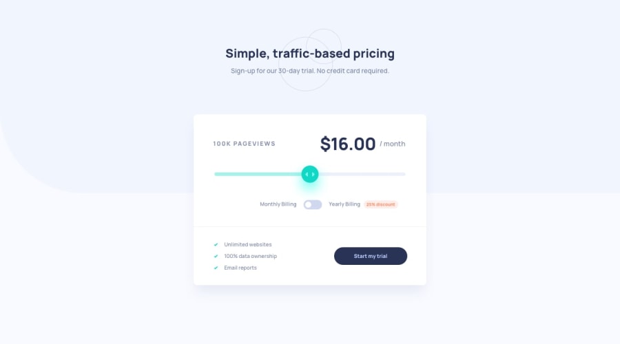
Design comparison
Solution retrospective
good, any contribution is welcome.!! 💪💪
Community feedback
- @AlexKMarshallPosted about 3 years ago
Visually this looks good, and it responds nicely at smaller screens.
There are some issues with the HTML though. Your heading elements don't make sense. Headings must be used in order, we can't go from an h1 to an h3 without an h2 in between for example. Here you have used a lot of headings for things that aren't headings and should be form control labels instead.
There's a bug with the pageview count, it's not updating when you change the slider.
The app is not usable with a keyboard. Always make sure to test your code with a keyboard and not just the mouse. Some things that will help fix that are:
:focus-visiblestyles on all interactive controls. Making the monthly/yearly price plan switch into a radio button group - this example should help https://scottaohara.github.io/a11y_styled_form_controls/src/radio-button--switch/In a real app, all of this would need to be wrapped in a
<form>element so you can submit the data to start the price plan.In general though the visuals look very good, and your CSS is well done, so it's well worth focussing on the HTML fundamentals and really getting them solid.
0
Please log in to post a comment
Log in with GitHubJoin our Discord community
Join thousands of Frontend Mentor community members taking the challenges, sharing resources, helping each other, and chatting about all things front-end!
Join our Discord
