Submitted over 2 years ago
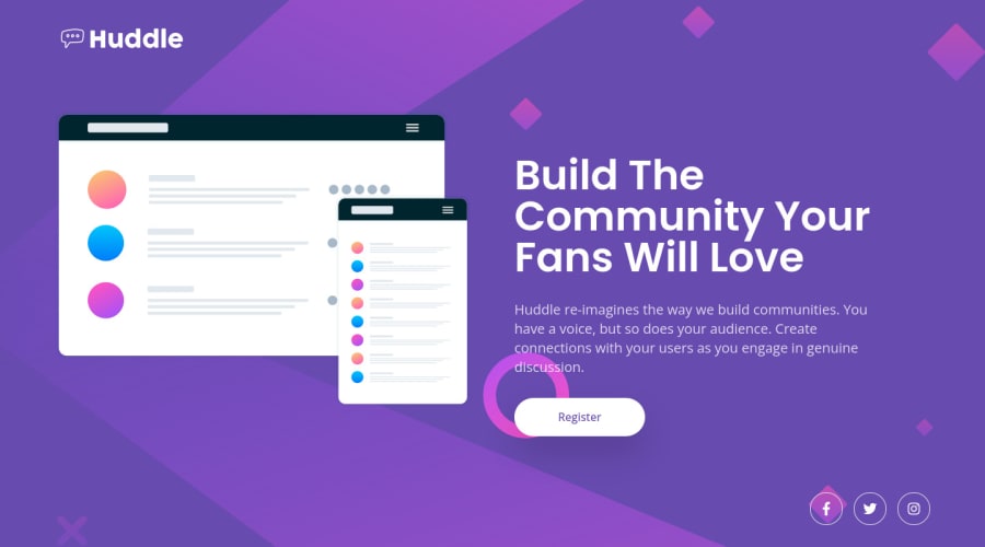
Project #3 Huddle Landing Page With Simple GSAP Animations
@codedforfree
Design comparison
SolutionDesign
Solution retrospective
So my third project is just one to practice some basic GSAP animation. I used inline svg code to be able to add some classes on the separate devices so i could animate them in separately.
Further more i positioned the mockups a bit 'out of bounds' on tablet sized devices. This look better then a resized image imo. Wouldn't you agree? Or would you do something else?
Lastly i didn't focus on making it pixel perfect. I think it looks good on multiple screens and i don't have acces to design files.
I hope you like this basic project and looking forward to any feedback or comments.
Community feedback
Please log in to post a comment
Log in with GitHubJoin our Discord community
Join thousands of Frontend Mentor community members taking the challenges, sharing resources, helping each other, and chatting about all things front-end!
Join our Discord
